How a booklet takes shape: a 6-step design process for an organisation's newsletter
Using a youth service centre's newsletter as the example: sort the content, set the grid, illustrations, colours and fonts, then check before print.
Watch the reel on InstagramComment #流程 to get this guide
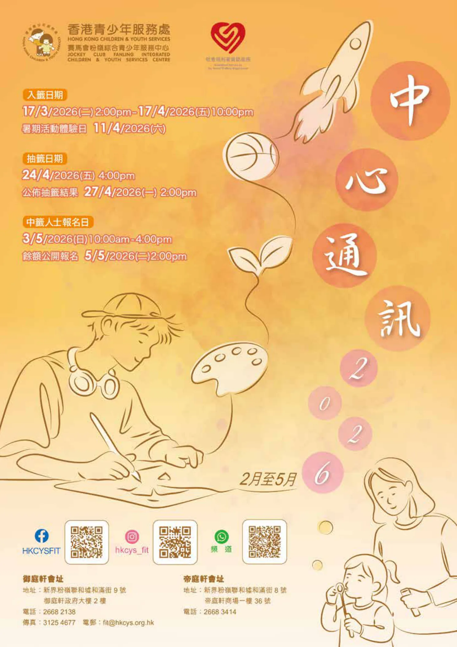
The "Centre Newsletter 2026" in the Reel is an A4 booklet we designed for a youth service organisation. It has lots of activities, dates and sign-up details, so the order was: make it easy to read first, then make it look good.
This guide breaks the process into 6 steps, each with a method you can use straight away. It works for club magazines, community newsletters and course handbooks too.
011. Sort the content: decide what goes on the cover
The most common problem with organisation newsletters is that every piece of information wants to be big. Sort all the content into three levels first, and the layout cleans itself up.
- Level 1: the activity name and who it's for (for example "Basketball class for secondary students"). This is what readers must see within 3 seconds.
- Level 2: date, time, place and fee. Only interested readers look at these.
- Level 3: how to sign up, the QR code and the phone number. Readers look at these only once they decide to sign up.
- Put only the key level-1 activities and the organisation's name on the cover. Everything from levels 2 and 3 goes inside.
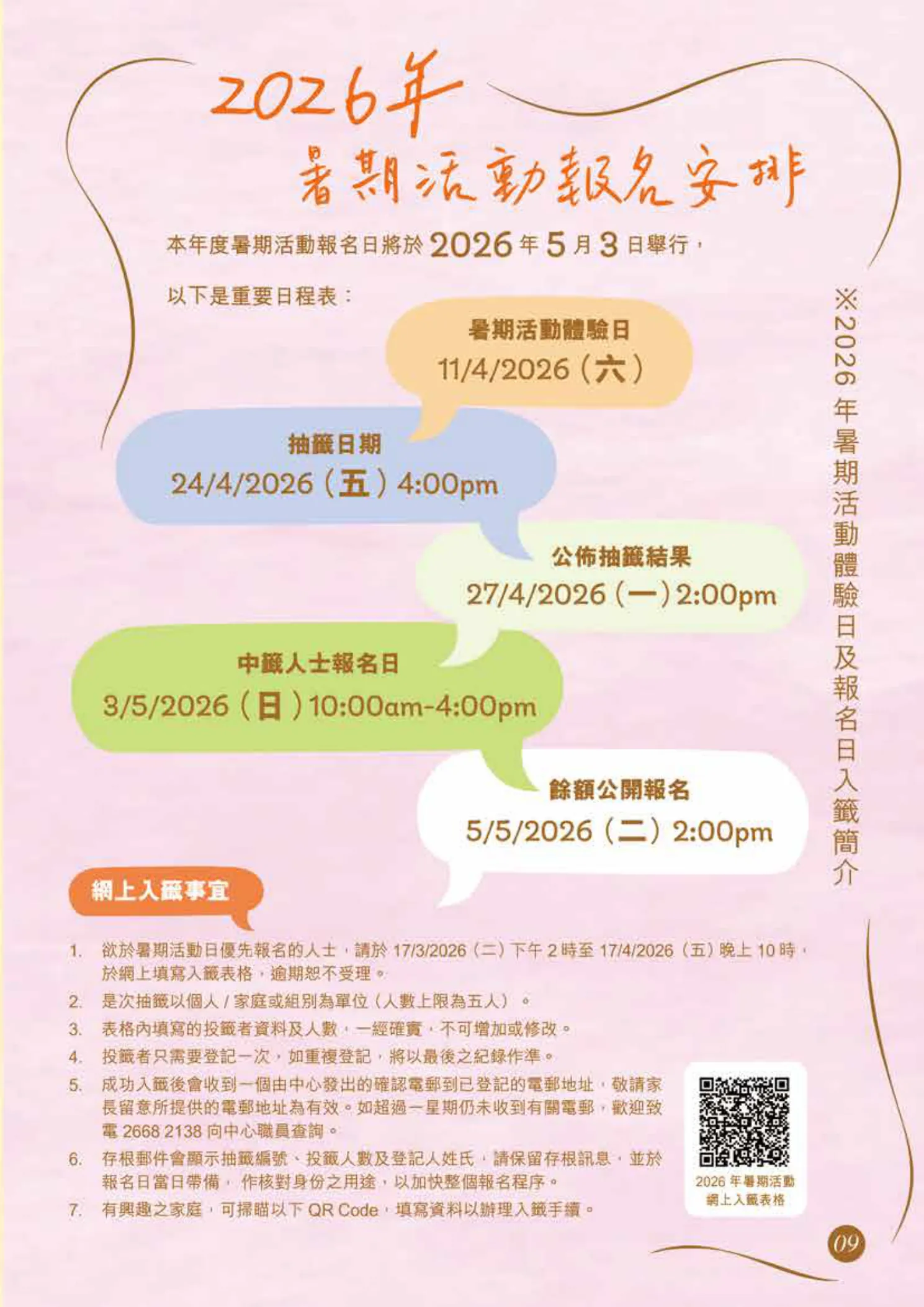
022. Layout grid: one set of rules to the last page
- Keep a vertical title column on the right. Every spread's section name sits here, in the same place on every page, so readers always know which section they're in.
- Put a round badge at the top of the title column. The same shape carries each section's name, like a "stamp" on every page.
- Keep sign-up dates and times on the left, with information aligned to the same left edge.
- Once columns, margins and spacing are set, save them as a parent page and apply that same parent to every page.
A grid isn't a limit. It means that on page 12 you don't have to decide again "where does this heading go?"
033. Illustration system: one line style, one theme
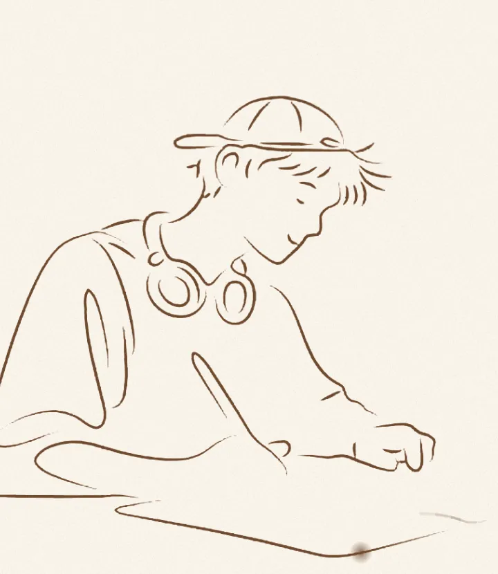
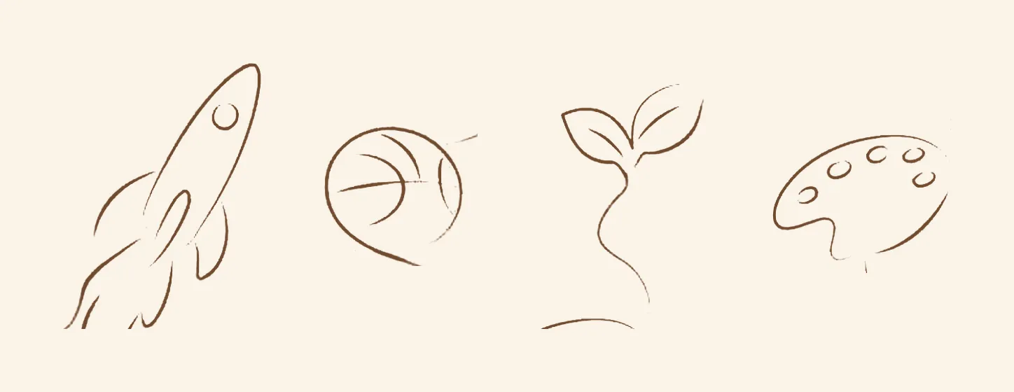
- Use brown single-line drawings for the whole booklet, with the same line weight and no shading.
- Every object goes back to the same theme. This one is "growing up", so it shows a rocket, a basketball, a sprout and a boy making art.
- Each small object on the cover stands for a section inside, and readers meet it again when they turn to that page.
- Draw 5 to 6 objects as a set first, check the style is consistent, then keep drawing.
044. Colour: gradient zones, one main tone per spread
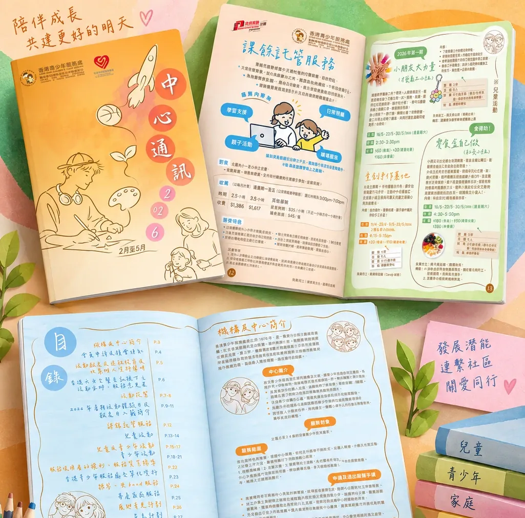
- Use an orange-to-off-white watercolour gradient for the main visual. It's warm but doesn't fight the text.
- Give each spread a different light main tone (light orange, light green, light blue), so readers know they've reached a new section when they turn the page.
- Always use dark text on light areas. Don't put body text on the darkest part of the gradient.
- Use no more than 4 main tones plus 1 dark text colour across the booklet.
055. Fonts: titles with a hand-made feel, information that's clear
Use a handwritten-style font for titles to match the illustrations. Dates, places and phone numbers always go in a clear sans-serif, because readers will type them into their phones while reading.
- 1 font for titles and 1 font for body text. Just those two for the whole booklet.
- Body text at least 9 pt. For newsletters read by parents and older readers, use 10 pt or more.
- Where there are lots of numbers (dates, times, fees), use a monospaced font or a sans-serif with clear numerals, so 1 and l, 0 and O don't get mixed up.

- Noto Sans TC — Free for commercial use; a top pick for Traditional Chinese body text
- Noto Serif TC — Free for commercial use; for titles
066. Pre-press check: text, dates, print file
- Check every date, time and fee against the client's original material once more. A wrong date in print is the most expensive mistake.
- InDesign's Preflight panel must show "No errors": no missing links, no missing fonts, and images at 300 effective PPI or higher.
- Export as PDF/X-4 with crop marks and document bleed ticked, and send it to the print shop.
- Ask the client to sign off on the PDF before it goes to print.
07Let AI sort it for you
When you get a pile of activity details, ask ChatGPT or Claude to do step 1 for you first.
You are a newsletter editor. Below are all the activity details for an organisation's next newsletter. Put each activity in one row, with these columns: activity name, audience, date and time, place, fee, how to sign up. Then suggest which 3 activities are best for the cover, and explain why.
Activity details: <paste here>