Hand-drawn look in 3 tricks: ink lines, simple characters, crayon color clash, plus an AI prompt
No drawing skills needed: wobbly ink lines in Procreate or Illustrator, a 3-shape character, crayon colors offset 4 to 6 px, and AI art turned into vectors.
Watch the reel on InstagramComment #手繪 to get this guide
A hand-drawn look is not about drawing well. It comes from three small details: lines that wobble a little, very simple characters, and colors printed slightly off on purpose. Here are the tool settings and steps for the 3 tricks from the Reel.
At the end you'll find an AI prompt, plus how to turn an AI image into a vector you can recolor.
011. Ink lines: they don't need to be straight, let the end wobble
Lines are the first key to a hand-drawn look. A perfect computer-drawn line looks like a vector right away. A little wobble and some change in thickness give it a human touch.
- Procreate: Brush Library > Inking > Studio Pen. Keep pressure on: press hard at the start, ease off at the end.
- Illustrator: draw with the Pencil tool and set Smoothness low, so the lines keep the wobble of your hand.
- Lines don't need to be straight. You can leave closed shapes open on purpose, with a small gap.
- Draw each line in one stroke. Don't go back over it. A line traced twice looks stiff.
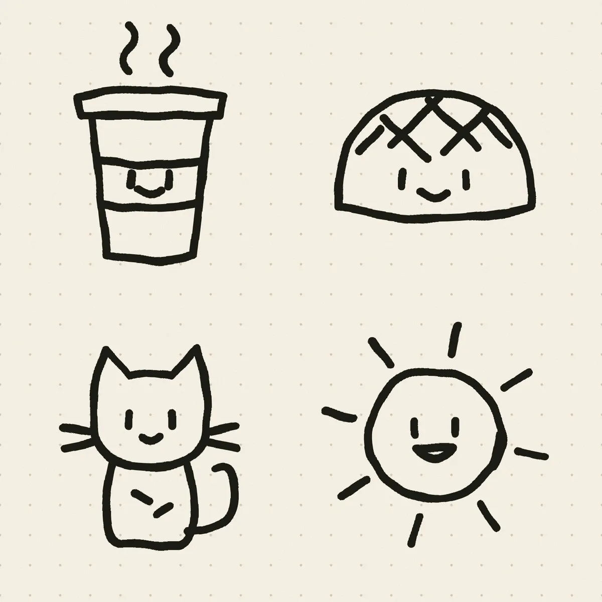
022. Simple character: round body, two dot eyes, one smile line
The simpler the character, the cuter it is, and the easier it is to reuse across pages.
- Body: one circle or oval. No arms or legs needed.
- Eyes: two black dots. Set them a little far apart for a goofy, cute look.
- Mouth: one smile line, no wider than the distance between the eyes.
- Blush: two small pink circles below and outside the eyes. The personality shows right away.
- Give the same character new expressions and accessories (a hat, glasses, a little flag) and you have a whole set.
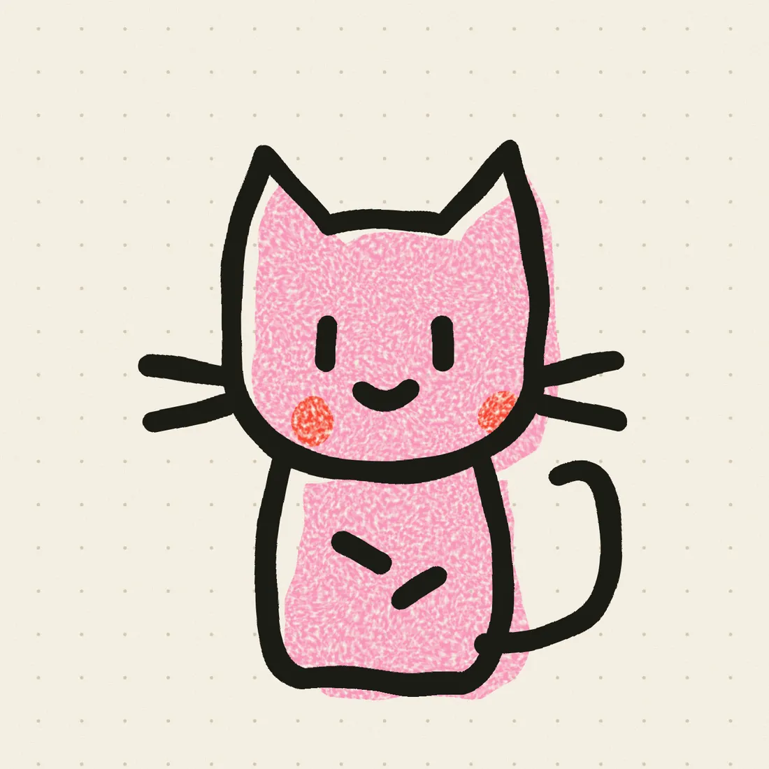
033. Crayon color clash: offset the color from the lines on purpose
- Pick 3 to 4 highly saturated colors from different color families. The clash gives you the playful crayon feel.
- Put the color fills and the line art on separate layers.
- Move the whole color layer 4 to 6 px in one direction, like a print where the colors didn't line up.
- Add a crayon or pastel texture to the color layer (in Procreate, fill directly with a crayon brush; in Photoshop, add a texture layer set to Multiply).
Keep the offset direction the same across the whole piece: all down-right or all up-left. If each color block goes a different way, it looks badly drawn, not like a style.
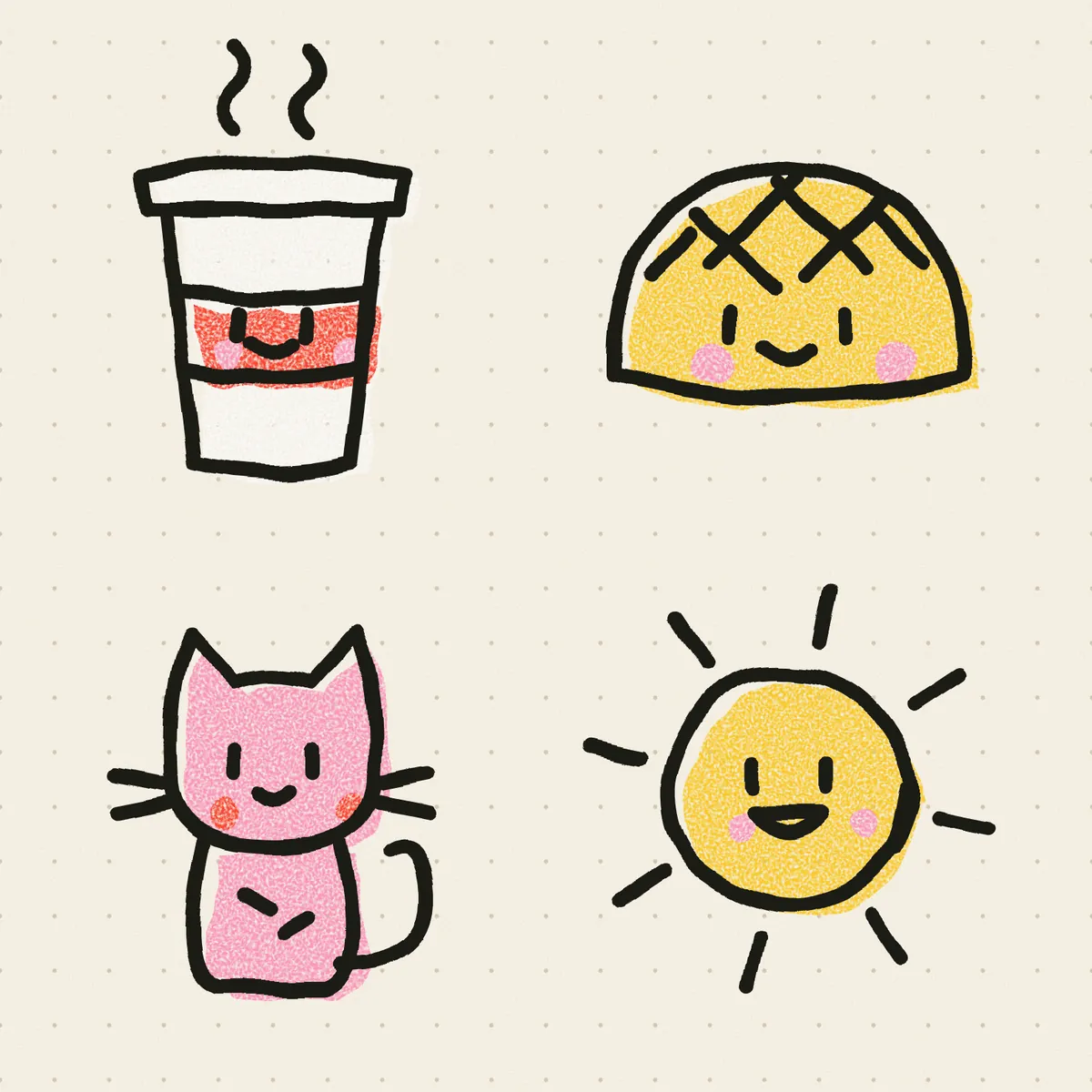
04Generate it with AI, then turn it into a vector
No time to draw? Generate a base image with AI first. English prompts work best. Replace [your product] with what you want to draw.
hand-drawn doodle mascot of [your product], wobbly black ink outline, crayon texture fill, bright clashing colours, off-register print, white background
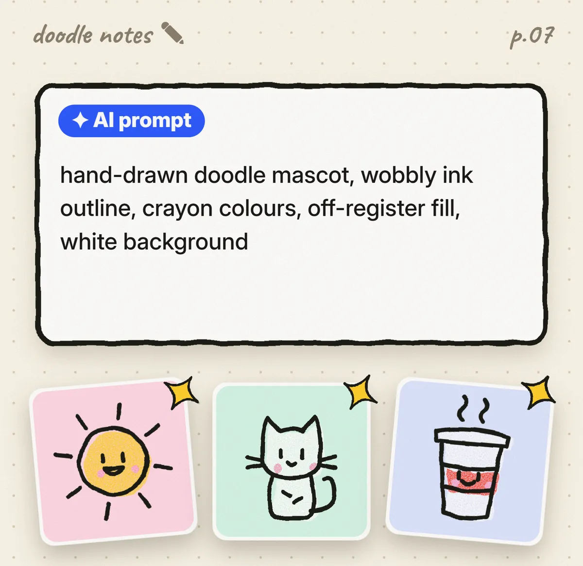
- Place the generated PNG in Illustrator.
- Select the image and click Image Trace in the Control panel at the top. Choose the 6 Colors or 16 Colors preset.
- Click Expand. The image becomes vector paths you can select and recolor one by one.
- Use Select > Same > Fill Color to select every path of one color at once and recolor them together.