InDesign layout in 6 steps: an event poster from blank document to print file
Document setup, CMYK swatches, the main image, a hand-lettered title, a timeline and PDF/X-4 export: an A4 event poster that's ready to print.
Watch the reel on InstagramComment #排版 to get this guide

This is the full layout process behind the summer event poster in the Reel. The video squeezes 4 hours into 55 seconds. Here every value and shortcut is written out.
Follow along and you can lay out an A4 portrait poster in about an afternoon, and the print shop won't send it back.
011. Document setup: lock in the print specs first
Set the poster's size, bleed and margins right at the start. If you change the size halfway through, everything you've already laid out will shift.
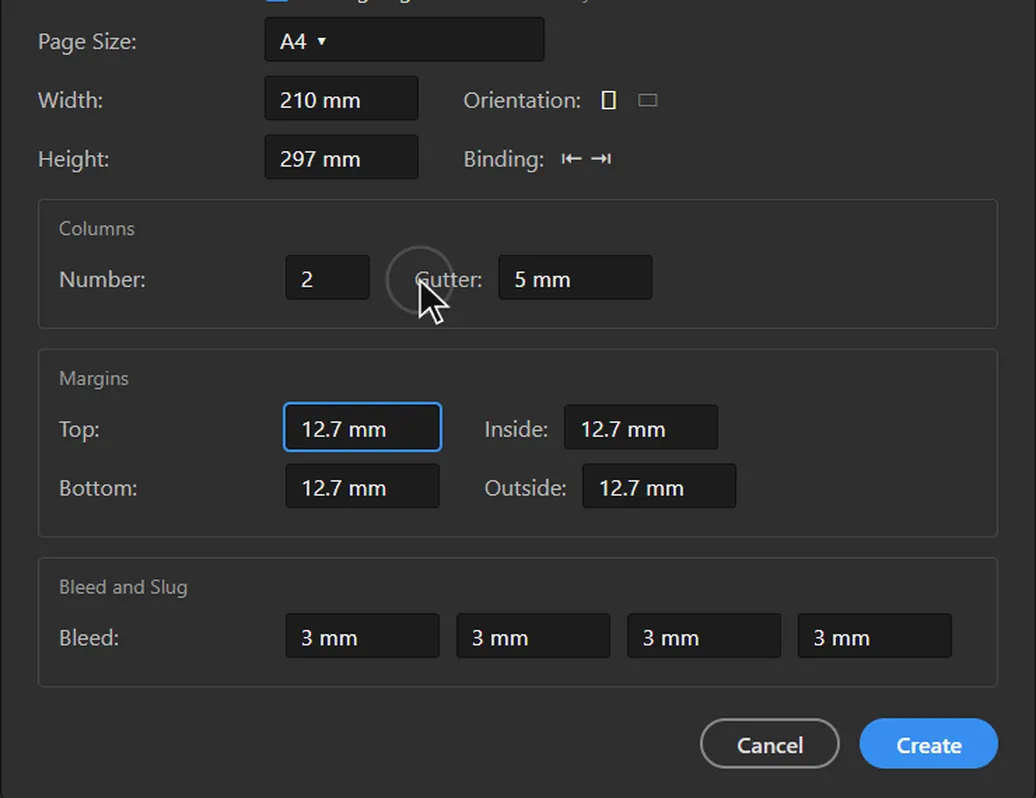
- New document: A4 portrait, 210 × 297 mm.
- Bleed: 3 mm on all four sides. Full-bleed colours and images must reach the bleed line, so no white edge shows after trimming.
- Margins: 12.7 mm. Keep important text and logos inside the margins.
- Columns: 2, with a 5 mm gutter. The title can span both columns, and the body text and sign-up details each take one column, so the layout stays tidy.
022. Swatches: use CMYK, not RGB
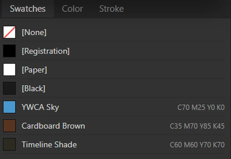
RGB colours you see on screen print darker and greyer. Build CMYK swatches directly in the Swatches panel and use only those colours across the poster, so the print matches what you had in mind. This poster uses three colours:
- Sky blue: C70 M25 Y0 K0
- Cardboard brown: C35 M70 Y85 K45
- Dark base: C60 M60 Y70 K70 (don't use pure K100 black for dark areas; a four-colour dark has more depth)
033. Main image: place it, fill the frame, check the resolution
- Press Ctrl + D (Cmd + D on Mac) to place the image. Don't drag and paste it from the desktop, so the link stays clean.
- Press Ctrl + Alt + Shift + C for "Fill Frame Proportionally". The image fills the frame you drew.
- Open the Links panel and check that the effective PPI is at least 300. Below 300 it prints blurry; below 150 it always shows.
- Add a dark-to-transparent gradient over the bottom of the photo. Put white text on the gradient so it stays readable.
044. Hand-lettered title: draw it as vectors in Illustrator
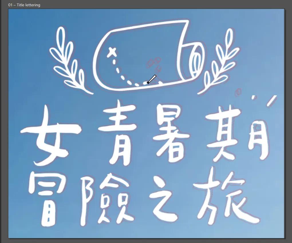
A hand-lettered title painted with a brush in a raster image goes blurry when you enlarge it. Draw it as vectors in Illustrator and it stays sharp at any size.
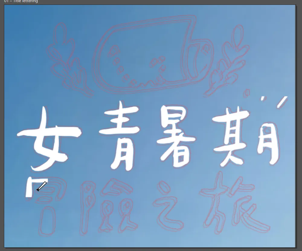
- Scan or photograph your sketch, place it in Illustrator, drop the layer opacity to 35% and lock it.
- Make a new layer and ink over the sketch stroke by stroke with an 8 pt brush. One stroke per path; if a stroke goes wrong, delete it and redraw it.
- Select all the brush strokes and choose Object > Expand Appearance to turn the brush strokes into filled paths.
- Save as an .ai file, go back to InDesign and place it with Ctrl + D. To change the title later, edit the .ai file and update the link.
055. Timeline: manage it with styles, change once and everything follows
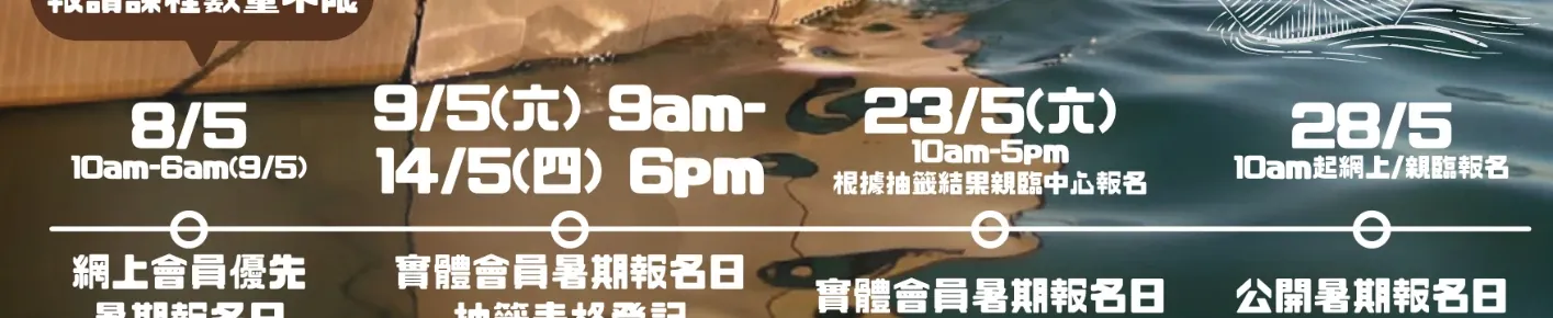
- Draw a main line with the Line tool as the backbone of the timeline.
- Draw a dot, select it and use Step and Repeat (Alt + Ctrl + U). Enter the count and spacing, and the dots line up evenly on the line.
- Create one paragraph style for dates and one for event names: dates in bold at a larger size, event names at body size.
- When the client changes the size or font later, edit the paragraph style and the whole timeline updates.
Paragraph styles are the InDesign feature most worth learning. Use them even on a one-page poster, because revisions always change the text.
066. Output: zero preflight errors, then export PDF/X-4
- Press W to switch to Preview mode. This hides guides and frame edges so you see the whole poster as it will print.
- Open the Preflight panel and check that the bottom-right corner says "No errors". A red light means a missing link, a missing font or an image with too low a resolution.
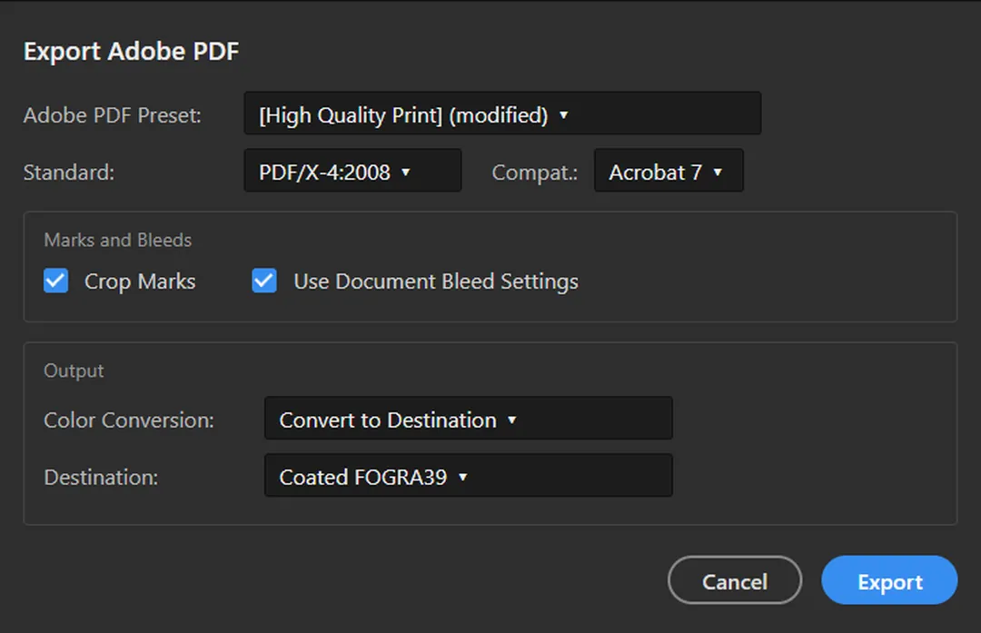
- Go to File > Export, choose Adobe PDF (Print), and pick the PDF/X-4:2008 preset.
- Under Marks and Bleeds, tick "Crop Marks" and "Use Document Bleed Settings" so the print shop knows where to trim.
07Let AI check it for you
When the layout is done, paste the poster's text into ChatGPT or Claude and ask it to read it as a viewer would.
You are a graphic designer. Below is all the text on an event poster. Sort it into three levels: "must be seen within 3 seconds", "read only if interested" and "read only when signing up". Then point out any information that is repeated or could be cut.
Poster text: <paste here>