8 rare design styles and how to make them: thermal, Risograph, cyanotype, halftone and more
Thermal, Risograph, 1-bit dither, concrete poetry, cyanotype, halftone, pixel sorting and neon. Photoshop steps and settings for each, plus one AI prompt.
Watch the reel on InstagramComment #風格 to get this guide
The Reel showed 8 styles that few people use. Here are the full Photoshop steps for each one. Most take under 10 minutes for a first version.
Want to see the look with AI before you start? There is an all-purpose prompt at the end.
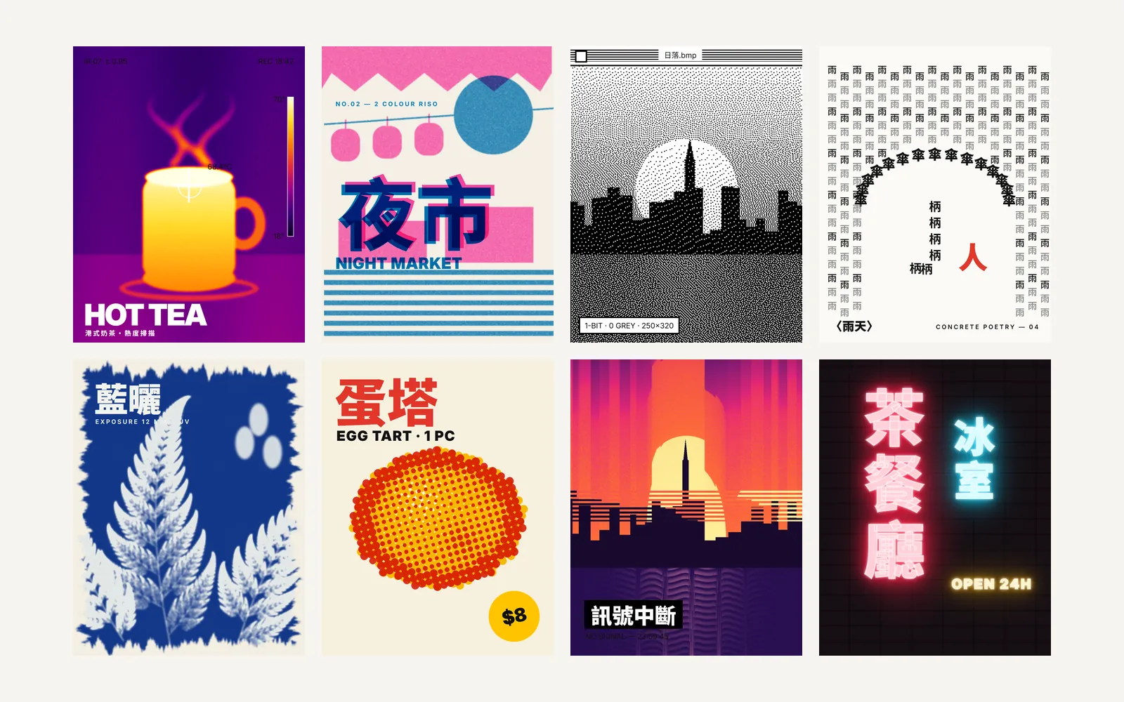
011. Thermal
- Turn the photo grayscale first: Image > Adjustments > Desaturate.
- Add a Gradient Map adjustment layer (Layer > New Adjustment Layer > Gradient Map).
- Set the gradient to six color stops, from dark to light: black, purple, red, orange, yellow, white.
- For a more thermal-camera look, add a little Gaussian Blur before the gradient map. The edges get softer.
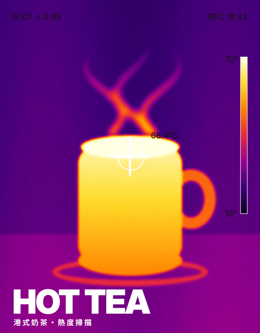
022. Risograph
- Use only 2 colors for the whole piece. Common pairs are fluorescent pink with blue, or orange with green.
- Put each color on its own layer and set the blend mode to Multiply. Where the two colors overlap, they get darker on their own.
- Move one layer 3 to 5 px down and to the right. This gives the off-register look of a misaligned print.
- Finish with a little noise over everything (Filter > Noise > Add Noise, 2 to 4%) to imitate paper texture.
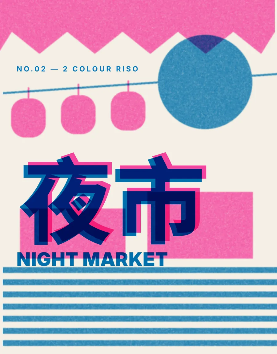
033. 1-bit dither
- Convert the image to grayscale first: Image > Mode > Grayscale.
- Then convert it to a bitmap: Image > Mode > Bitmap.
- Choose Diffusion Dither as the method. Set a low output resolution (for example 72 ppi) so the dots show more.
- When you are done, convert back to RGB mode. Only then can you add color or combine it with other layers.
044. Concrete poetry
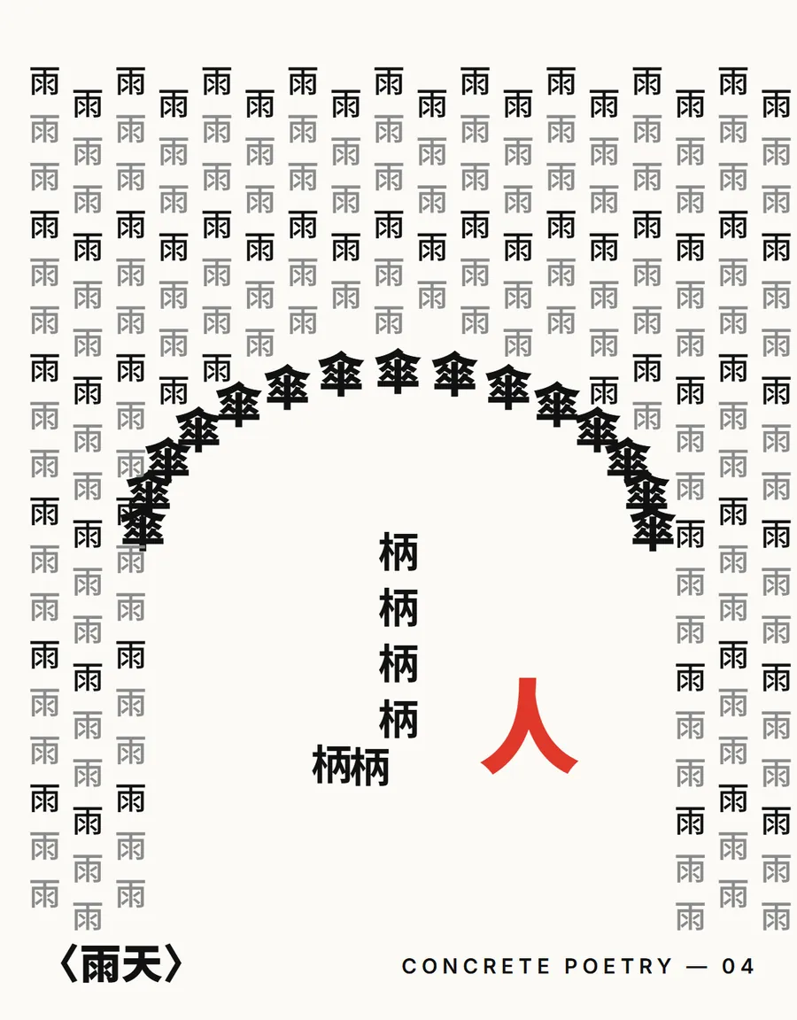
Arrange one character into the shape of your subject. For example, many 雨 (rain) characters form a shower of rain, or 山 (mountain) characters stack up into a mountain.
- Draw a silhouette of the shape first and use it as a guide.
- With the Type tool, repeat the same character over the silhouette. Let the size follow the light and dark areas: large and dense where it is dark, small and sparse where it is light.
- When you are done, hide the silhouette and keep only the text.
- Use a sans-serif font with clear strokes. Very thin fonts disappear when they get small.
055. Cyanotype
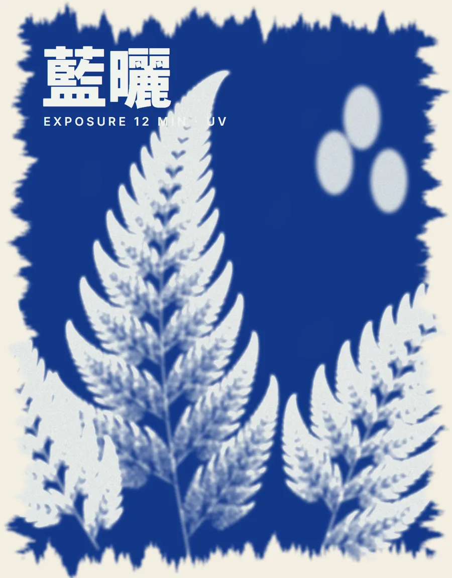
- Turn the subject into a silhouette and fill it with white.
- Use Prussian blue #12347F for the background.
- Soften the silhouette edges with Filter > Blur > Gaussian Blur at 0.5 to 1 px. Then add a rough paper texture layer and leave the edges a little ragged.
- Add some blue grain over everything. Don't make it too clean. The charm of cyanotype is in its imperfections.
066. Halftone
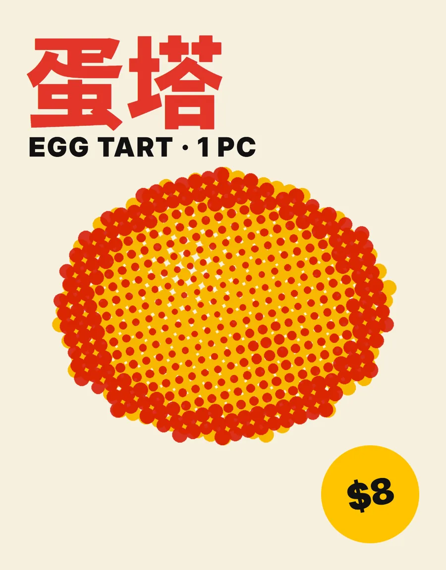
- Filter > Pixelate > Color Halftone.
- Set Max. Radius high (for example 12 to 20 px) so the dots are clearly visible.
- For a single-color look, convert the image to grayscale before you apply the filter.
- Set the dot layer to Multiply over a block of color for a retro comic look.
077. Pixel sorting
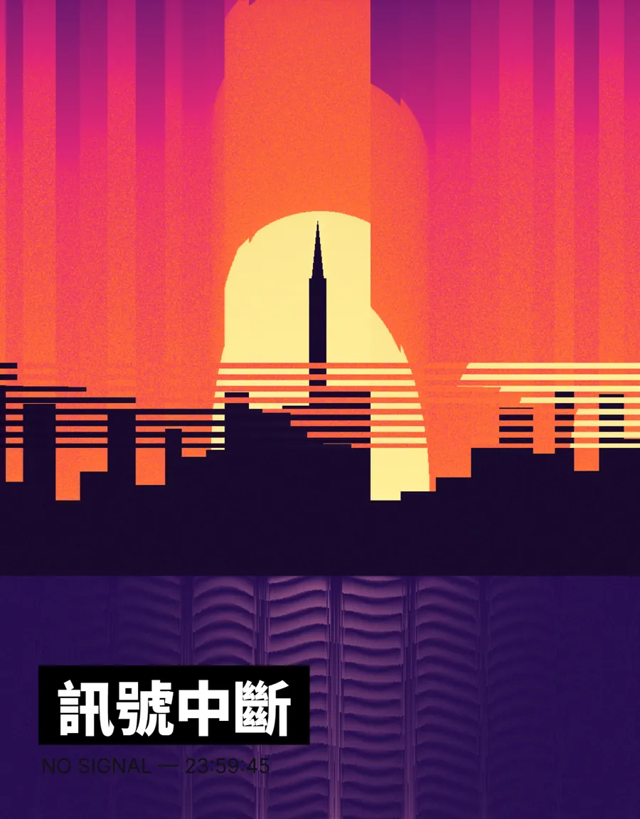
Pixel sorting reorders a row of pixels by brightness. This creates a streaky, flowing look. Photoshop has no built-in tool for it, so use a free pixel sorter (search "pixel sorter" to find web and open-source versions).
- Upload your photo and choose bright as the sort condition, so only the light areas get streaked.
- Choose a vertical or horizontal direction. Adjust the threshold slowly until the streaks are the right length.
- Export a PNG. Back in Photoshop, use a layer mask to keep the streaks only where you want them.
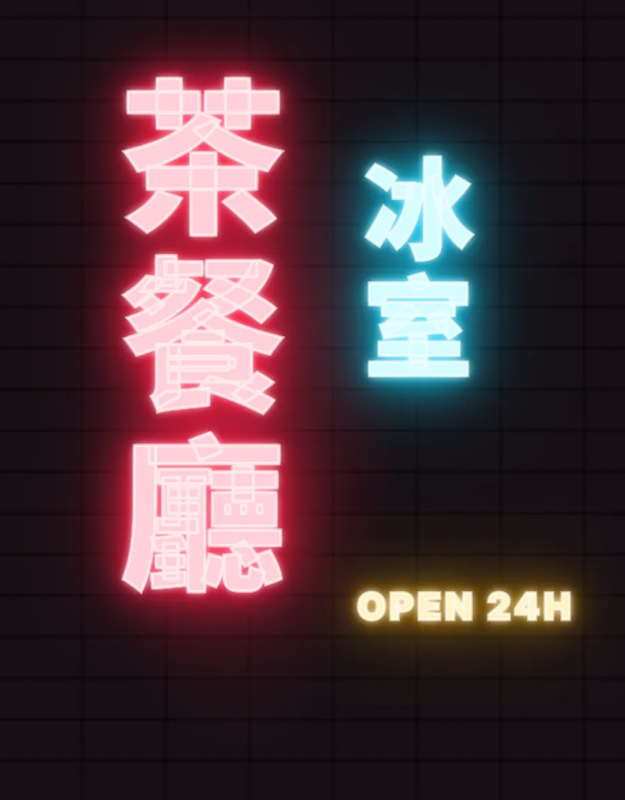
088. Neon sign
- Keep only the outline of the text: set the text layer fill to none and add a 2 to 3 px stroke.
- Open Layer Style and add 3 Outer Glow effects: the first small and bright (white or a light color, 5 px), the second medium (main color, 20 px), the third large and faint (main color, 60 px, 30% opacity).
- Use a very dark background (dark blue, dark purple or black) so the neon glows.
- For more realism, put a brick wall or concrete texture behind the text and change the glow Blend Mode to Screen.
09Let AI suggest a direction first
Not sure which style fits your subject? Ask ChatGPT or Claude for a direction first, then start making it.
Design a [style] poster about [subject] for me. List the colors, fonts and 3 key points.