Stop getting empty boxes from Claude: one homepage in 3 styles, glass, minimal and editorial
Collect Pinterest references, make cut-out product photos in ChatGPT, then have Claude Design lay out one homepage in glass, minimal and editorial styles.
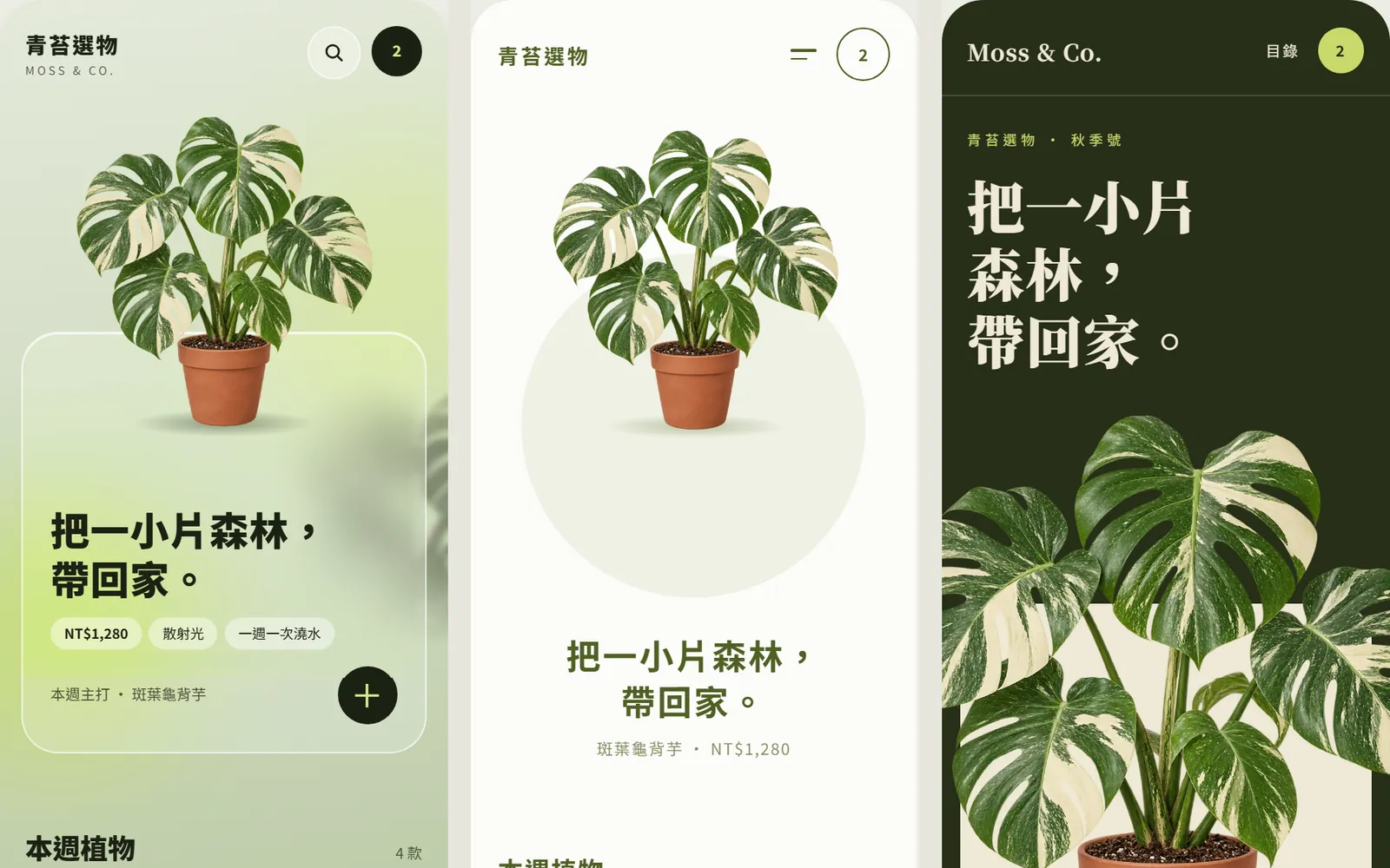
When you ask AI for a homepage, do you get a pile of grey boxes that say "image goes here"? AI can do more than empty shells. You just haven't given it any photos, or told it what "good-looking" means. In this guide we built a mobile homepage for a fictional plant shop, Moss & Co. (青苔選物): references first, photos second, and only then layout from Claude, with the same content in three styles at once. Every homepage screen below was really made by Claude Design, and the plant photos were made by ChatGPT.
01Open Claude Design (1 minute)
- Go to claude.ai/design and sign in to your Claude account. You can also use it right inside a regular Claude chat.
- Start a new project. We picked the "UI mockups" template, which is made for app and web screens.
- Don't start typing yet. Getting your photos and references ready first makes a big difference.
Claude's official page says Claude Design is included in every plan, including the Free plan. The standalone claude.ai/design site stays open until December 14, 2026, and Claude Design already works in regular Claude chats. Template names aren't listed on the official page and may change.
- Claude Design official page — Plans, standalone site dates and export formats
02Step 1: look at Pinterest and write down what makes it good
AI doesn't know what "good-looking" means to you. Find a few designs that really are good and put into words why they work. Those words go straight into your prompt later.
- Search Pinterest for "plant shop mobile app ui", or swap in your own industry, such as "coffee shop app ui".
- Pick the 3 to 5 you like best.
- Write one line on why each one works. Ours: every card is a real product photo; the hero plant breaks out of its card; one green family plus white or near-black; big rounded cards, a big price and one round button; no more than three things per screen.
- Then look at how the three styles differ: glassmorphism is a gradient background with frosted-glass cards, minimal is a white background, and editorial is a dark background with big serif headlines.
03Step 2: make cut-out product photos in ChatGPT
A homepage looks empty because the cards have nothing in them. Make the product photos in ChatGPT first, all with the same light and angle, so together they look like one shop.
Make a product photo of a [variegated monstera] in a [terracotta pot], straight-on at eye level, soft studio light, pale cream background. In this same chat I'll also ask for [a staghorn fern, a moss ball and a fiddle-leaf fig], so keep the same light, angle and size.
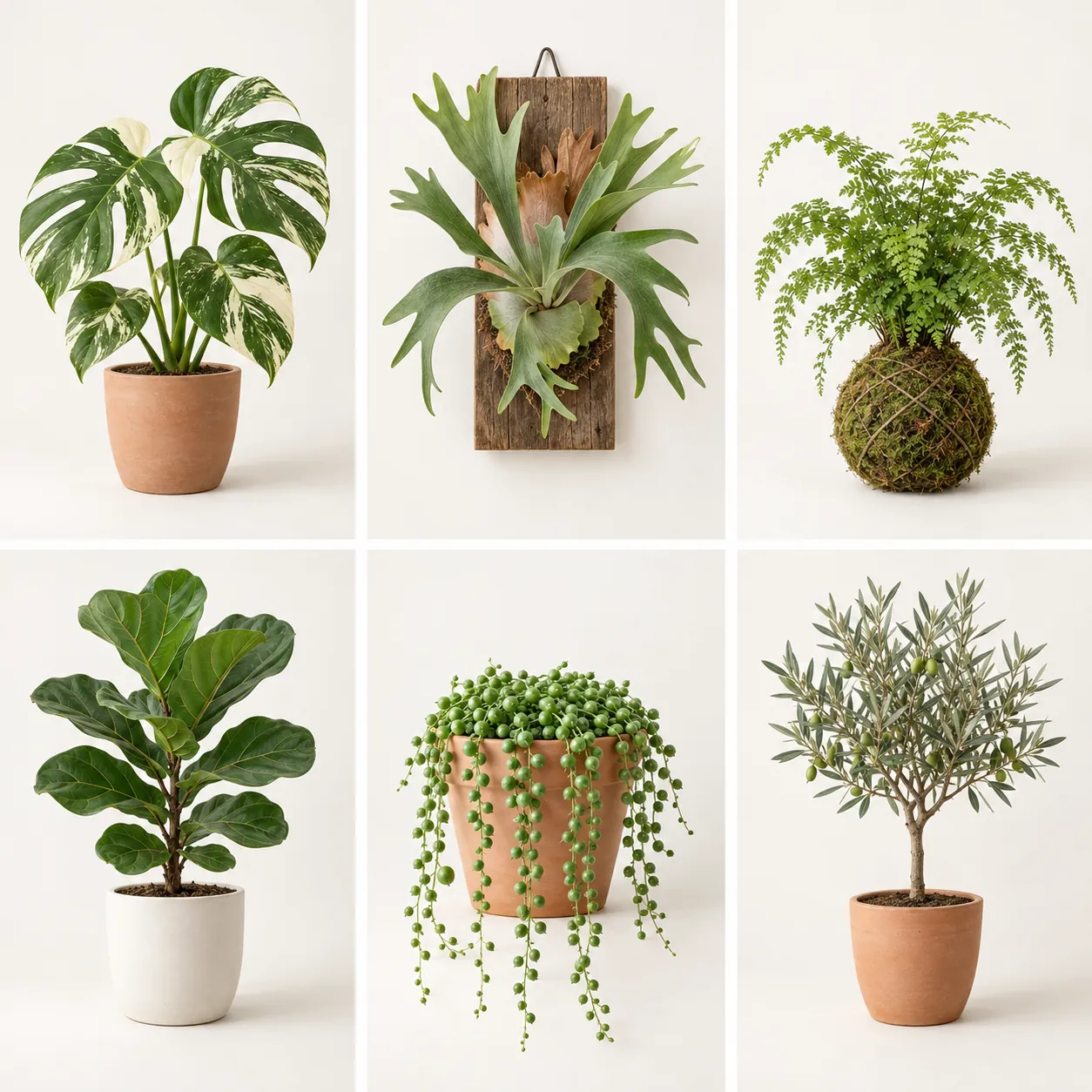
Then ask it to turn each photo you'll use into a PNG with a transparent background. Once it's cut out, the same photo looks clean on a pale green gradient, on white and on dark green, so all three styles can share it.
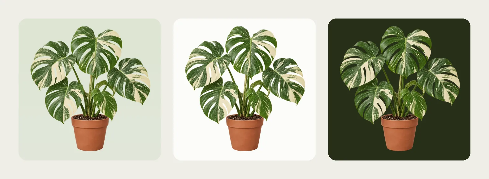
04Step 3: one prompt, the same content in three styles
- Attach the cut-out PNGs to your Claude Design project.
- Paste the prompt below and replace the [ ] parts with yours.
- The "what makes it good" notes from step 1 become the "direction" part of the prompt.
Make a mobile homepage for [shop name]: the same content in 3 styles side by side, A glassmorphism, B minimal white space, C magazine editorial. Direction: every card uses the cut-out product photos I attached, and the hero breaks out of its card; only one [main colour] family plus white or a dark colour; big rounded cards, a big price, one round button. All text in Traditional Chinese, no grey placeholder boxes.
"The same content" is the key. All three versions share the tagline, products and prices, so the only thing you're comparing is the style. Our tagline, 把一小片森林,帶回家。 ("Bring a small piece of forest home"), the plants of the week and the prices were all written by Claude.
05Step 4: see what makes the three styles different
A, glassmorphism: a pale green gradient background, with cards made of semi-transparent frosted glass, a thin white edge and a blurred leaf shadow showing through. The hero monstera grows out of the top of the card, and the price, light and watering notes sit in three small pills.
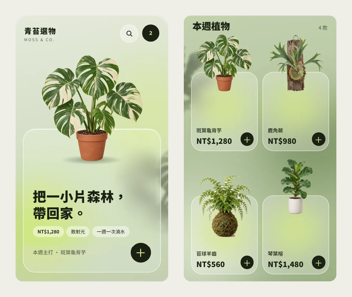
Our first version of A didn't look much like glass; it looked like semi-transparent white cards. We asked for a glow behind the cards while keeping the plants sharp, and that's when the glass look appeared.
The cards in version A look like plain semi-transparent white cards. Add a soft [lime green] glow behind each card, keep the cards as semi-transparent frosted glass with a thin white edge, and keep the product photos standing sharp on top. Don't change B or C.
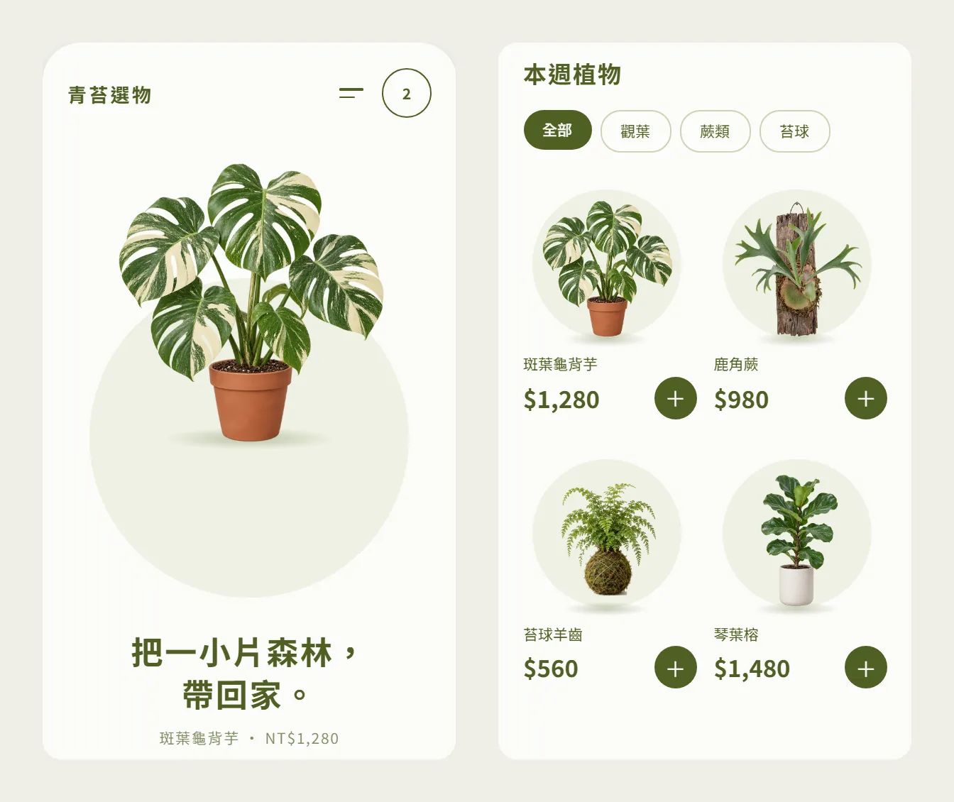
B, minimal white space: almost all white, with one moss green. The plants sit in pale circles, a row of pill filters (All, Foliage, Ferns, Moss balls) runs across the top, and the prices are big.
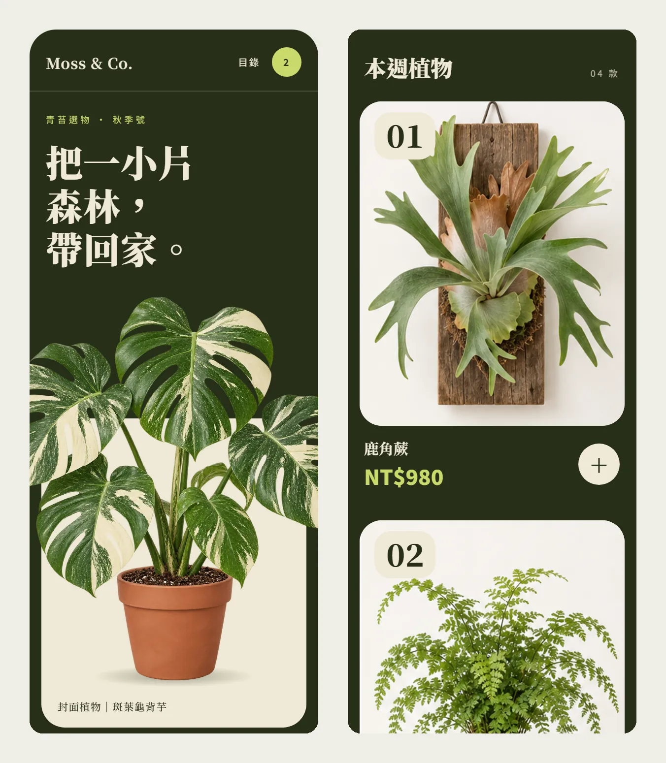
C, magazine editorial: a dark green background with a big cream serif headline, like the cover of a plant magazine. The hero monstera spills past both edges of the phone, and the products become large numbered cards, 01 to 04.
06Step 5: compare the three side by side, then build out one long page
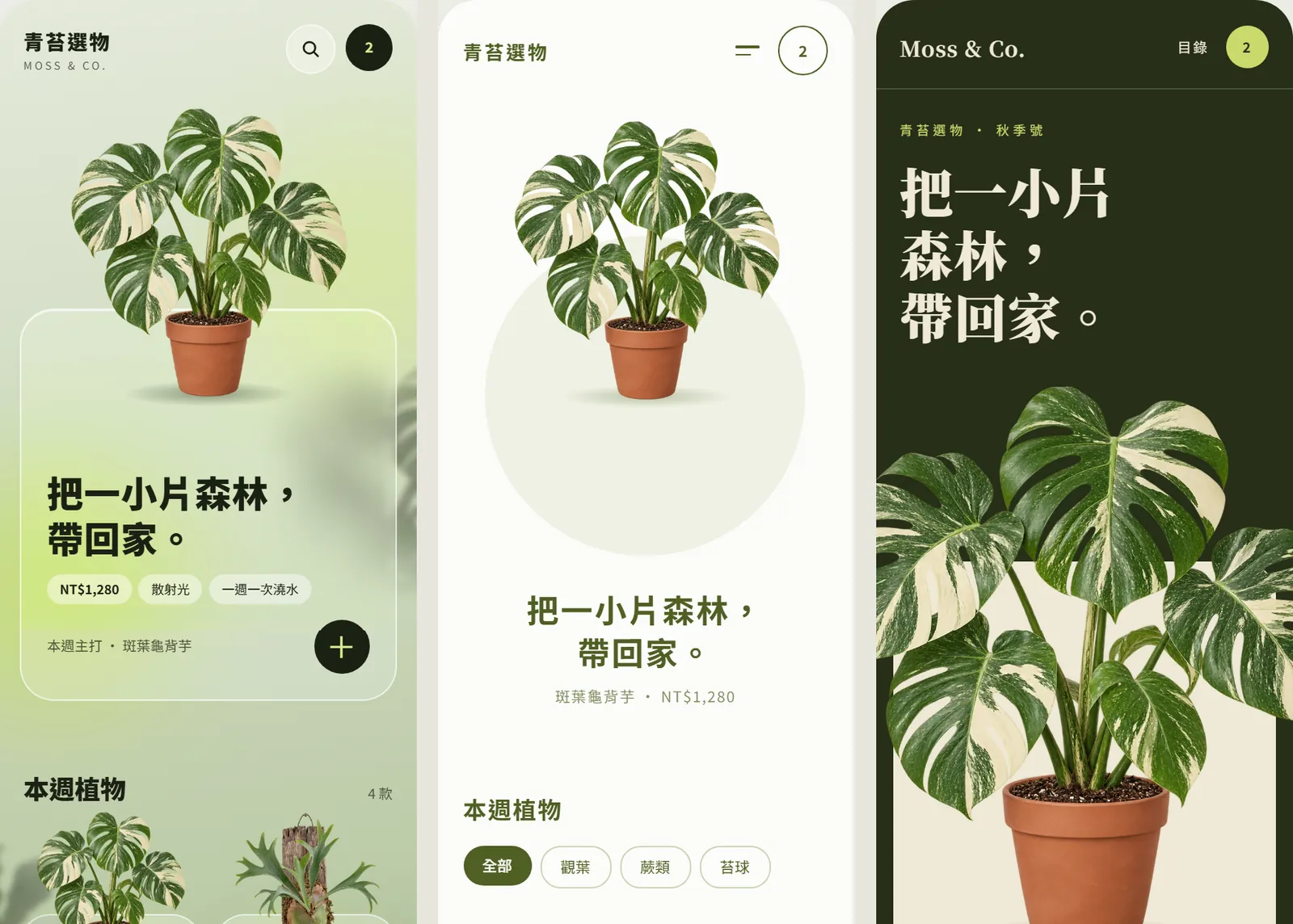
Side by side is the easiest way to decide. When you show a client or a teammate, send this one image instead of explaining each version. We picked C and asked Claude to finish the whole page.
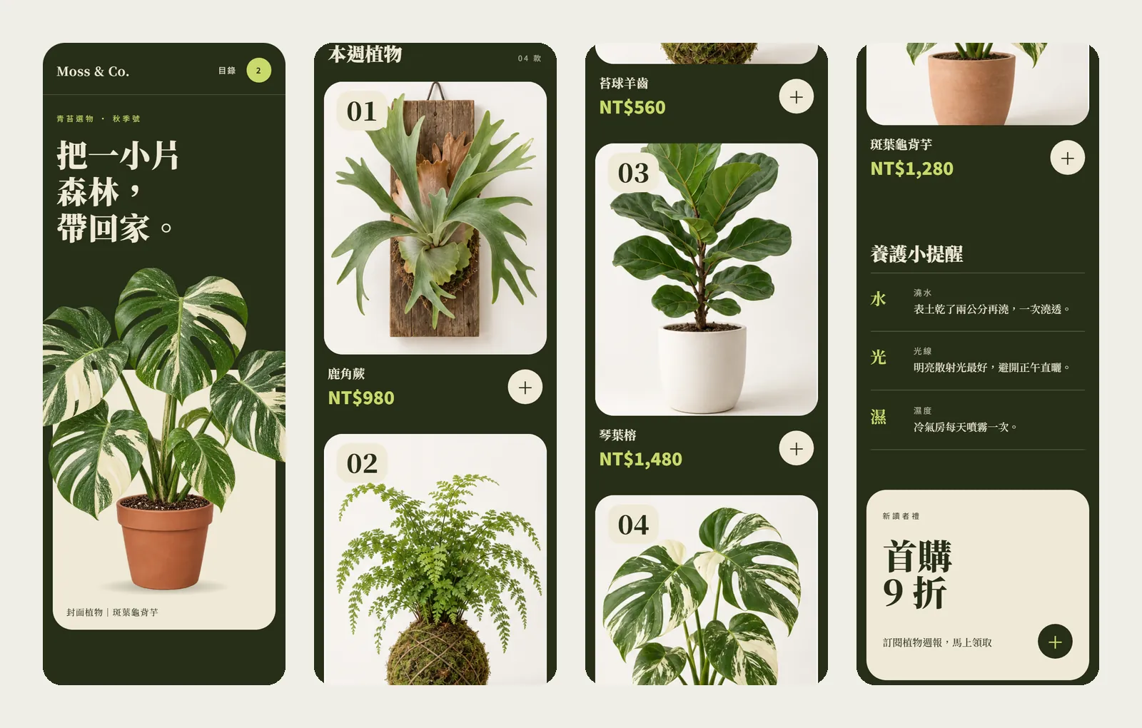
I'm going with [C, magazine editorial]. Turn this version into a complete long mobile homepage: navigation, hero, [plants of the week], [care tips], [first-order offer] and footer. Keep the same photos and text, and never show the same photo twice in a row.
- For small changes, name the exact section to change and say everything else stays the same.
- When it's done, use the export option to save it as PDF, PPTX or standalone HTML, or send it to Canva.
- To turn it into a real website, hand the design over to Claude Code to keep building.
07Good to know
- Moss & Co. is a fictional brand. The homepage layouts and copy were made by Claude Design and the plant photos by ChatGPT, as a demo.
- The prices, offer and care tips were written by AI for a fictional brand. Replace them with your shop's real information before going live.
- Text on glass needs to be dark enough and big enough. A semi-transparent card lets the colours and leaf shadows behind it show through, so version A uses dark green-black text and dark buttons to stay readable. Body text should have at least 4.5:1 contrast against its background.
- When you build the glass effect as a real web page, it's usually done with the CSS backdrop-filter property, which blurs what's behind the card. The card itself has to be semi-transparent for the effect to show.
- Pinterest images only set the direction. Put only your own photos or images you generated on the page.
- This guide was made in October 2026 on claude.ai/design with the UI mockups template. The interface and template names may change later. The standalone site is open until December 14, so export important projects first.