6 design terms with real numbers that make Claude build websites like a designer
Hierarchy, whitespace, alignment, type pairing, primary colour, contrast: each term comes with numbers to paste into Claude, plus one all-purpose prompt.
Watch the reel on InstagramComment #術語 to get this guide
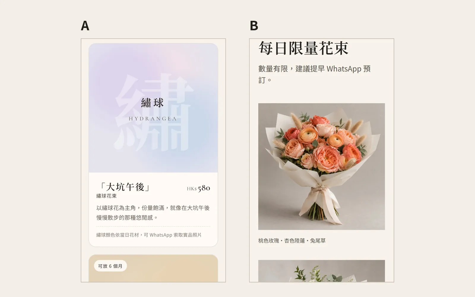
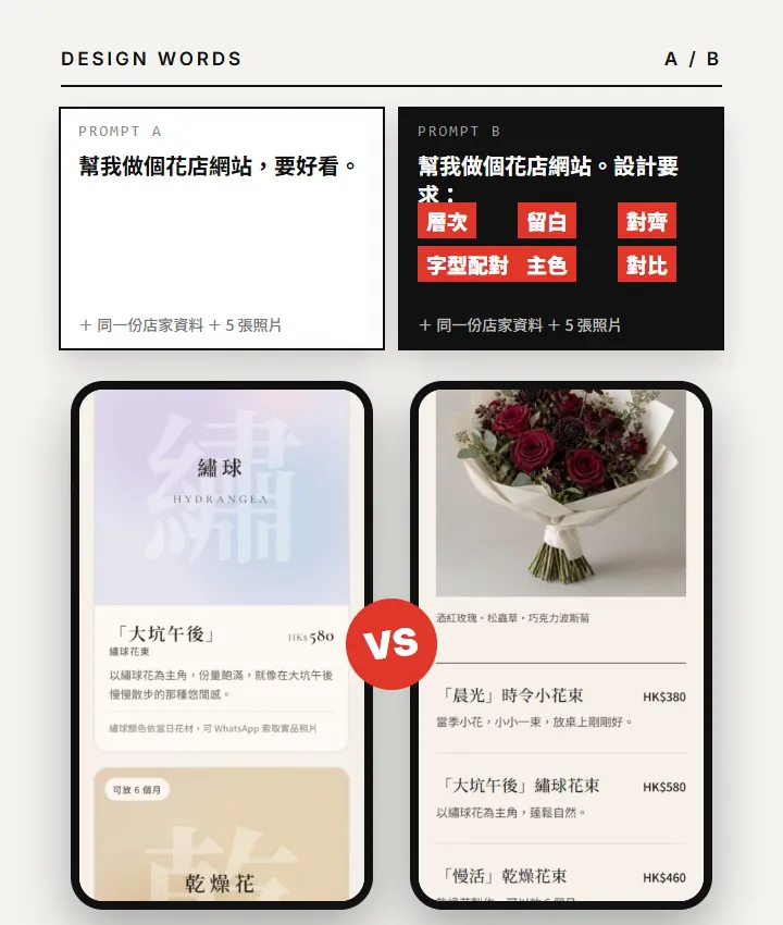
Same AI, same florist. Why does the one on the right look like a designer made it? The difference is not the AI. It is the words you use. Ask the AI to "make it look nicer" and it can only guess. Speak a designer's language and it knows what you want.
This post covers the 6 terms from the Reel in full: what each term means, why it uses that number, and how to paste it into Claude.
011. Hierarchy
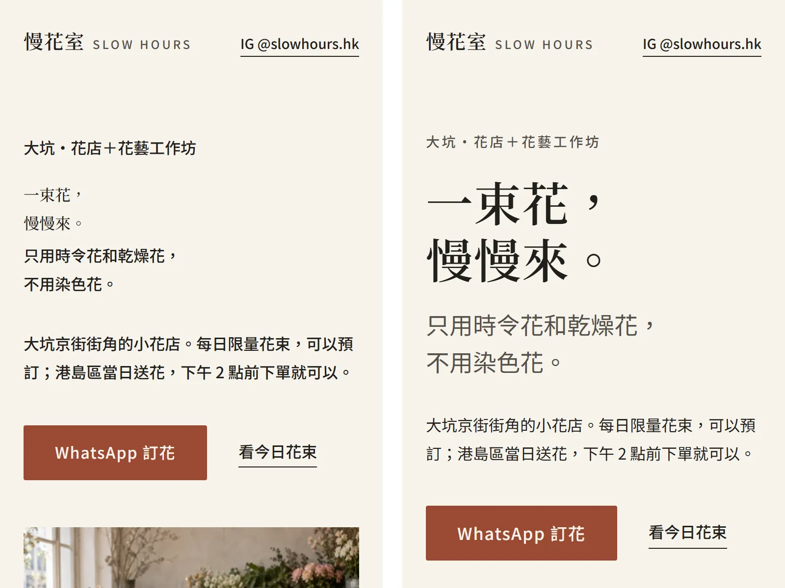
Hierarchy lets readers see what matters most at a glance. To get it, the gap between font sizes has to be big enough, and it should follow a fixed ratio, not random tweaks.
One big headline, subheads half the size. Font sizes 16 / 20 / 25 / 31 / 39px
16, 20, 25, 31 and 39 are a type scale that grows by 1.25 each step. 16px body text is the most common starting point on the web. Multiply by 1.25 for each level up, and the gaps between headings are just right, not too flat.
022. Whitespace
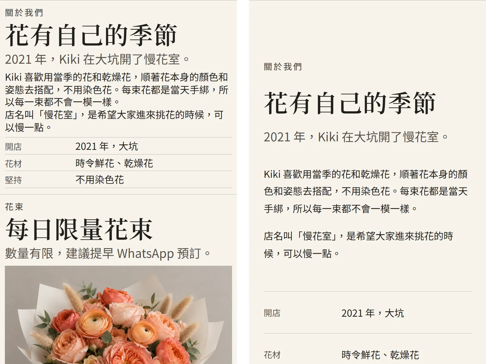
AI-made websites often feel cramped because the spacing has no system. Use multiples of 8 and all the spacing lines up.
Use multiples of 8 for spacing, 96px above and below each section, line height 1.6
8, 16, 24, 32, 48, 64 and 96 are all you need. 96px between sections gives the page room to breathe. A line height of 1.6 is the most comfortable range for Chinese body text.
033. Alignment
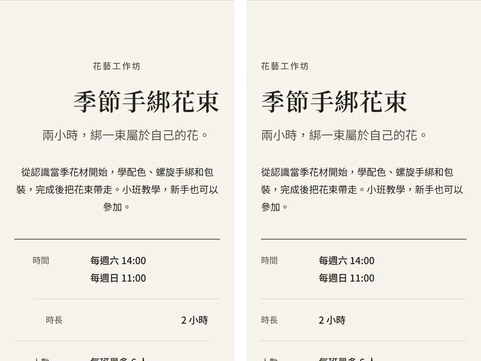
12-column grid, text left-aligned to one line, at most 40 characters per line
12 columns split into 2, 3, 4 or 6 equal parts, so any layout works. About 40 Chinese characters per line reads best. Past 50, the eye loses the start of the next line.
044. Type pairing
Two fonts at most: headlines Noto Serif TC, body Noto Sans TC
One serif plus one sans serif is the safest pairing: serif headlines feel refined, sans serif body text is easy to read. The Noto fonts are free for commercial use and cover the full Traditional Chinese character set, so no characters go missing.
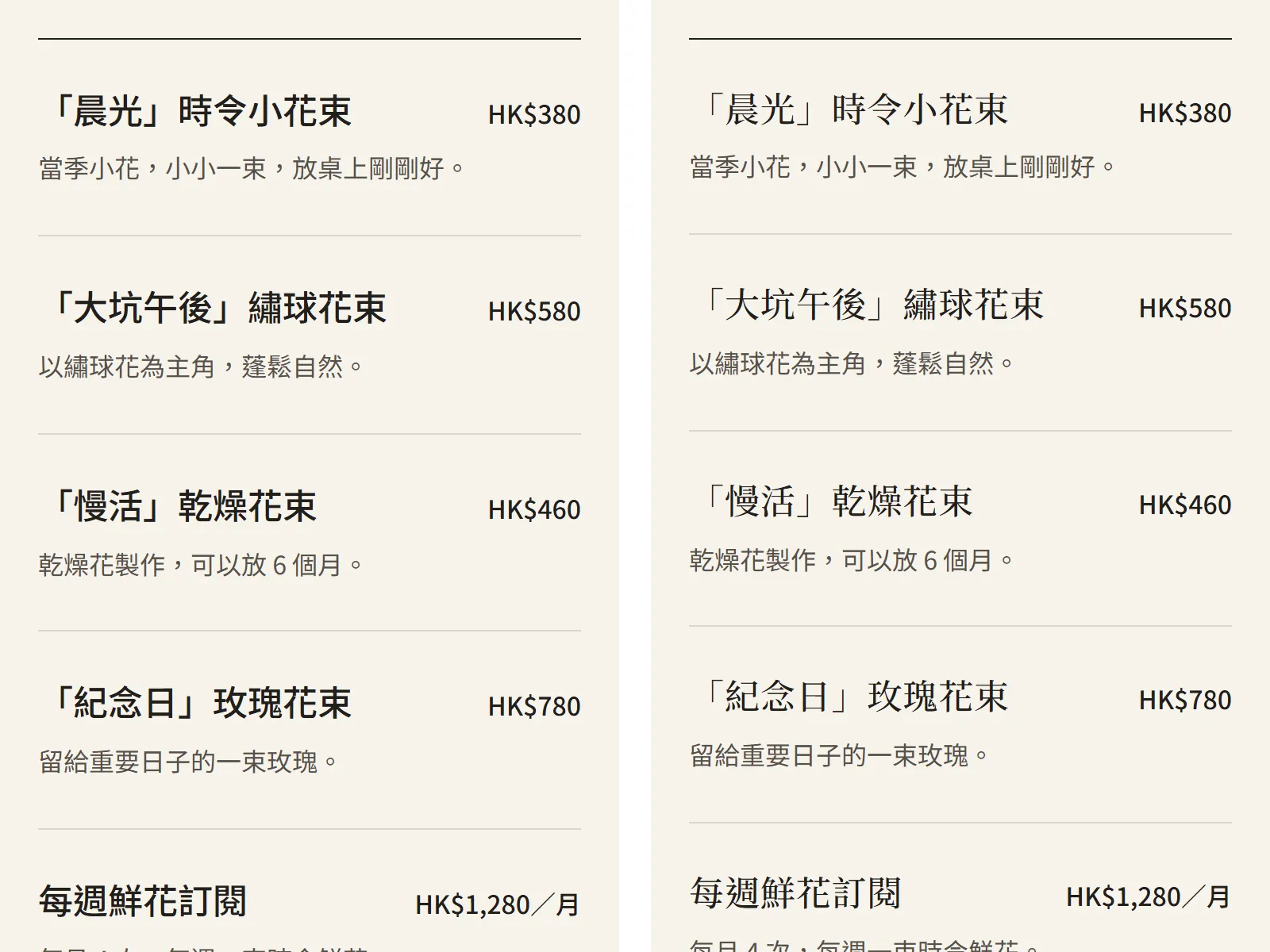
- Noto Serif TC — Headlines
- Noto Sans TC — Body
055. Primary colour
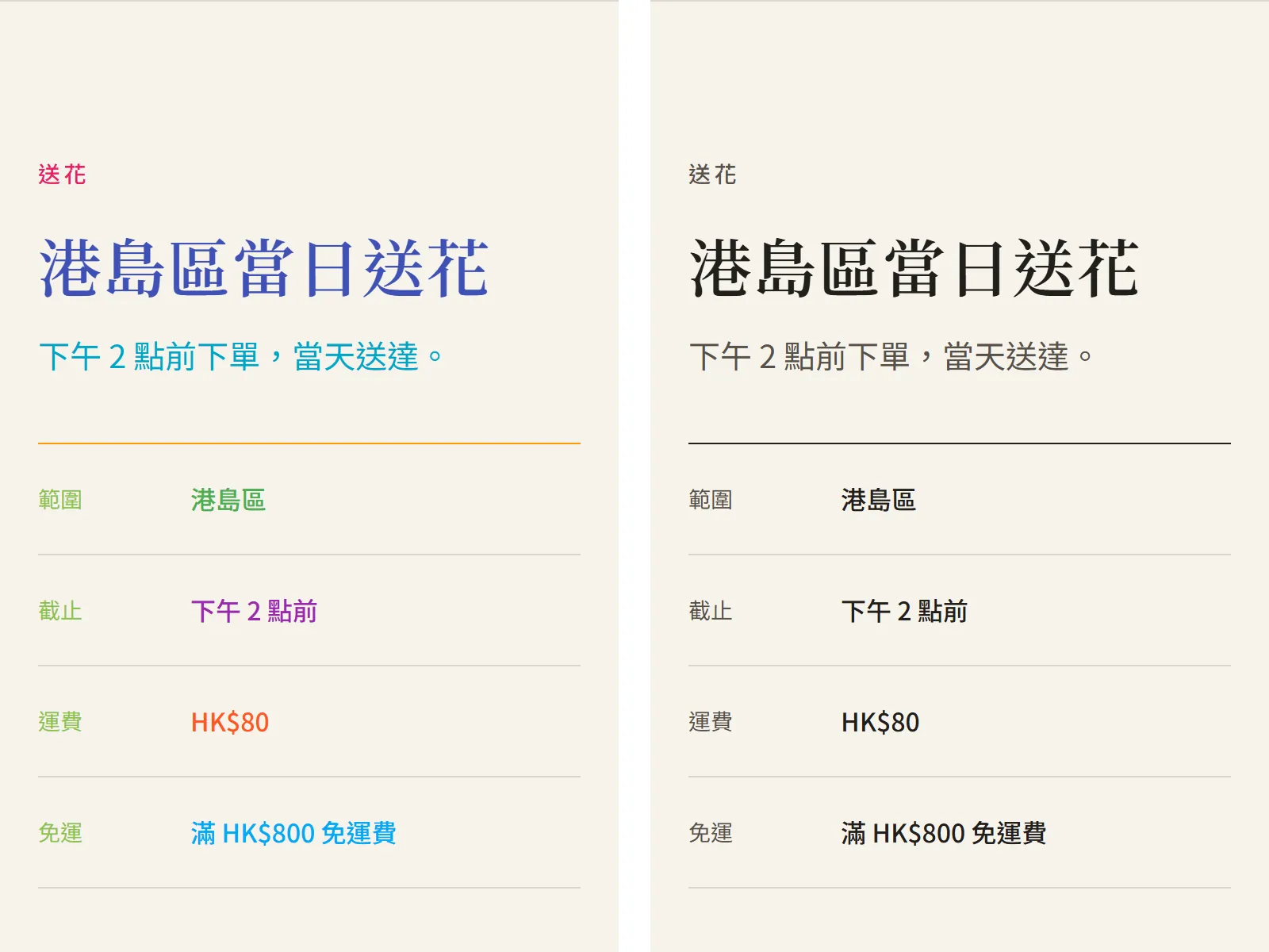
60 / 30 / 10 colour split, accent colour only on buttons and links
60% is the base colour (usually white or off-white), 30% is the secondary colour (section backgrounds, cards), and 10% is the accent. When the accent only shows up where people should click, readers know where to look.
066. Contrast
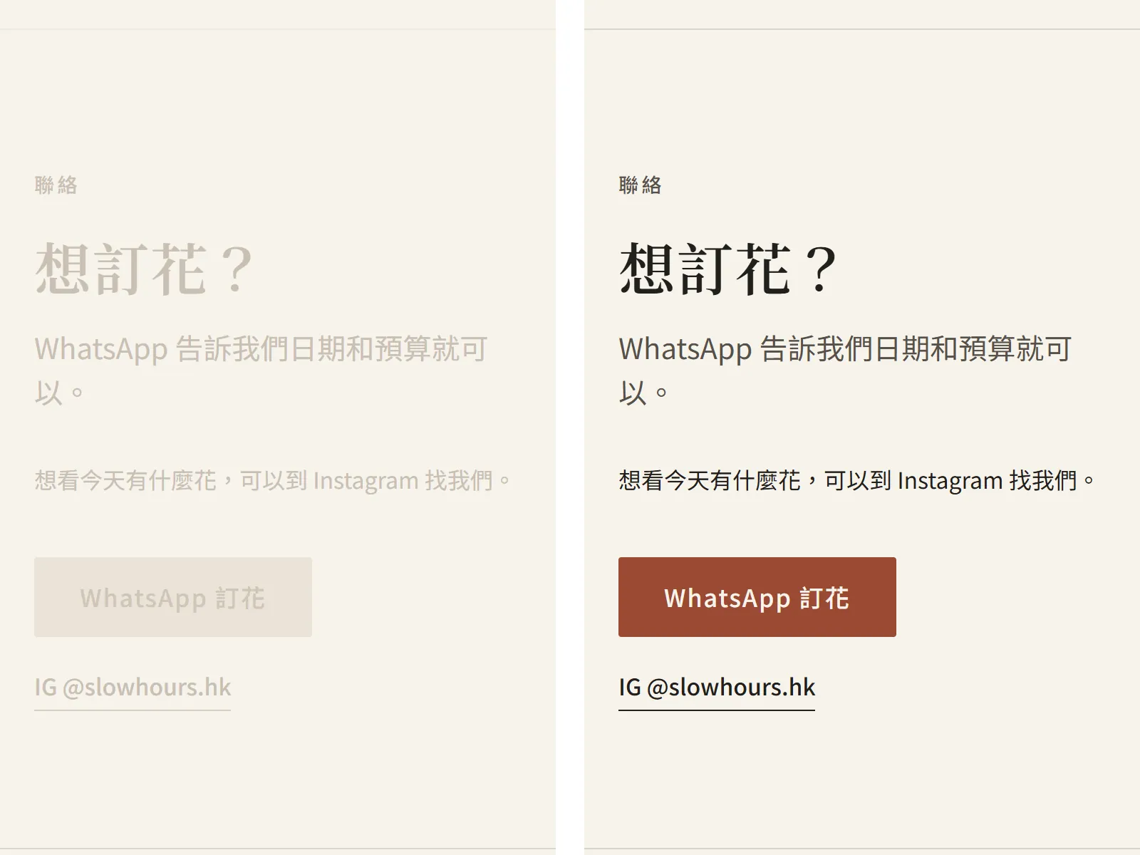
Text contrast at least 4.5:1, the main button stands out most on the page
4.5:1 is the WCAG accessibility minimum for normal body text. Grey text on a light background easily falls below it, and then nobody can read it on a phone in the sun.
07All-purpose prompt: paste all 6 at once
Paste the 6 rules into Claude together with your info. Ask for 3 directions first, then the full version. It saves time compared with building one version straight away.
Build me a [industry] website, following the 6 rules above exactly. Give me 3 directions to choose from first, then build the full version. Info: [paste here]
The full version to paste (6 rules + the all-purpose line):
Design rules:
1. One big headline, subheads half the size. Font sizes 16 / 20 / 25 / 31 / 39px
2. Use multiples of 8 for spacing, 96px above and below each section, line height 1.6
3. 12-column grid, text left-aligned to one line, at most 40 characters per line
4. Two fonts at most: headlines Noto Serif TC, body Noto Sans TC
5. 60 / 30 / 10 colour split, accent colour only on buttons and links
6. Text contrast at least 4.5:1, the main button stands out most on the page

Build me a [industry] website, following the 6 rules above exactly. Give me 3 directions to choose from first, then build the full version. Info: [paste here]