Make an event flier with Claude that looks like an illustrated poster, not a Word notice: 3 steps, plus 3 IG stories
Find refs on Pinterest, have ChatGPT paint one full scene, then let Claude Design lay it out: vertical title, date second, four lines, plus 3 story crops.
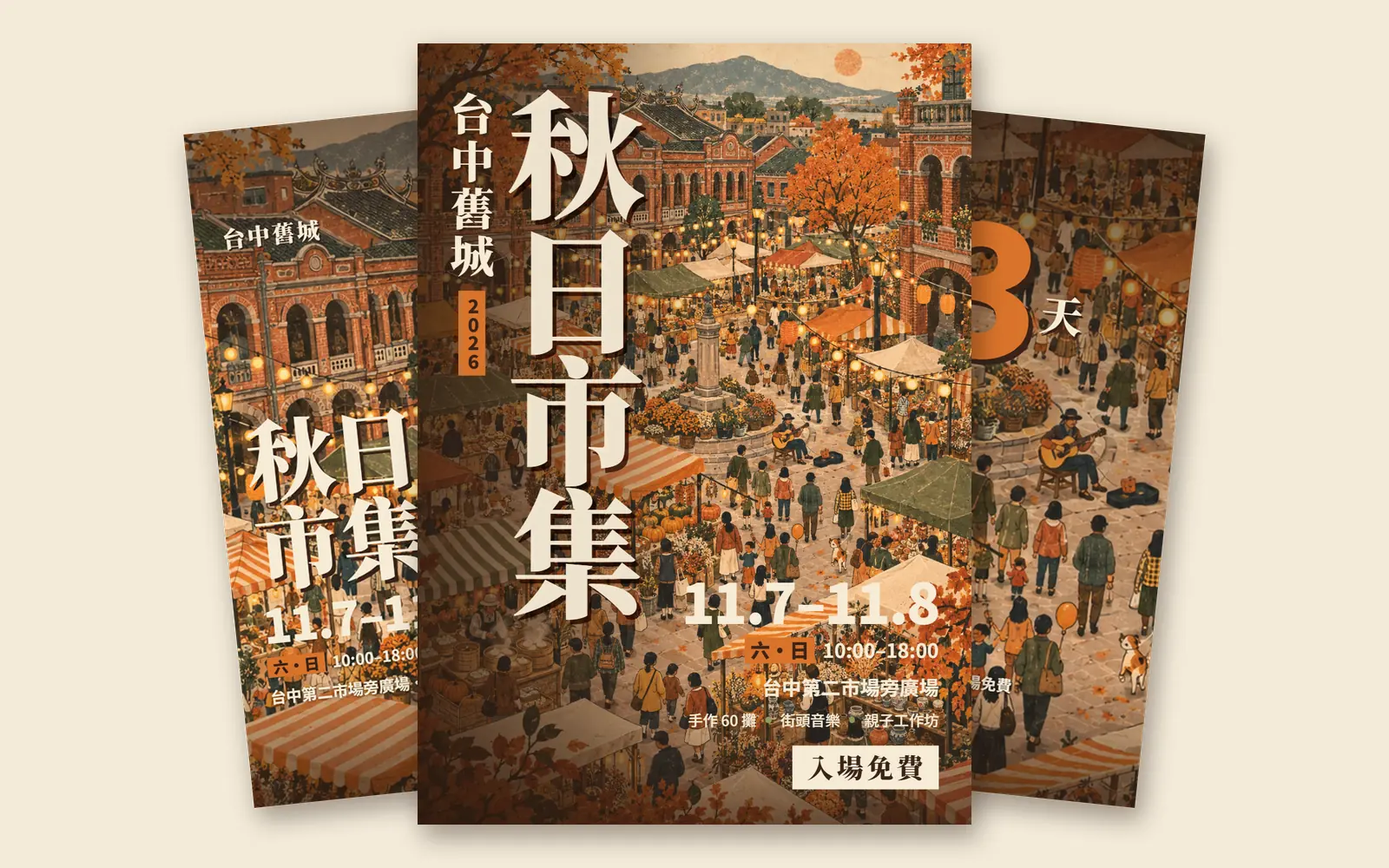
Why do other people's Claude-made event fliers look like illustrated posters while yours looks like a notice typed in Word? Claude can lay out a page. The problem is asking it to do everything at once. In this guide we followed one order, references first, then the illustration, then the layout, to make an A4 flier and 3 Instagram stories for a fictional event, the Taichung Old Town Autumn Market. Every image below is our real output: ChatGPT made the illustration and Claude Design made the layout.
01Before you start: 3 tools, one job each
- Pinterest: find 3 to 5 good event posters, only to learn the direction.
- ChatGPT: paint one full scene with no text in it, as the main visual.
- Claude Design: lay out the illustration, title and details as a flier, then crop the stories.
Claude's official article of 8 October 2026 says Design is out of beta and on every plan, including Free. You can open it at claude.ai/design; that standalone site stays open until 14 December 2026, and Claude Design already works inside normal Claude chats too.
- Claude Design — Works on the Free plan too
- Claude Design official page — Plans and site dates
02Step 1: find 3–5 references on Pinterest and write down why they work
- Search Pinterest for "autumn market event poster illustration", or swap in your own event type, such as night market, book fair or craft market.
- Pick 3 to 5 posters that make you want to go straight away.
- Write one line per poster on why it works: does the illustration fill the page? Is the title vertical? Is the date the second-biggest thing?
- Turn those lines into a "reference direction". You'll use it in the next two steps.
We picked 5 posters. Our reference direction came down to these 4 lines:
1. The illustration carries the page: one whole scene (crowds, stalls, food) or one giant hero object, never small clip art scattered around.
2. Type is the second hero: a chunky headline or a vertical CJK title, the date set huge, everything else small.
3. One warm colour family (pumpkin orange, brown, cream, a touch of green) with a printed, grainy texture.
4. Details are a short stack: date, place, three highlights, free entry. No paragraphs.
03Step 2: have ChatGPT paint one full scene, with no text
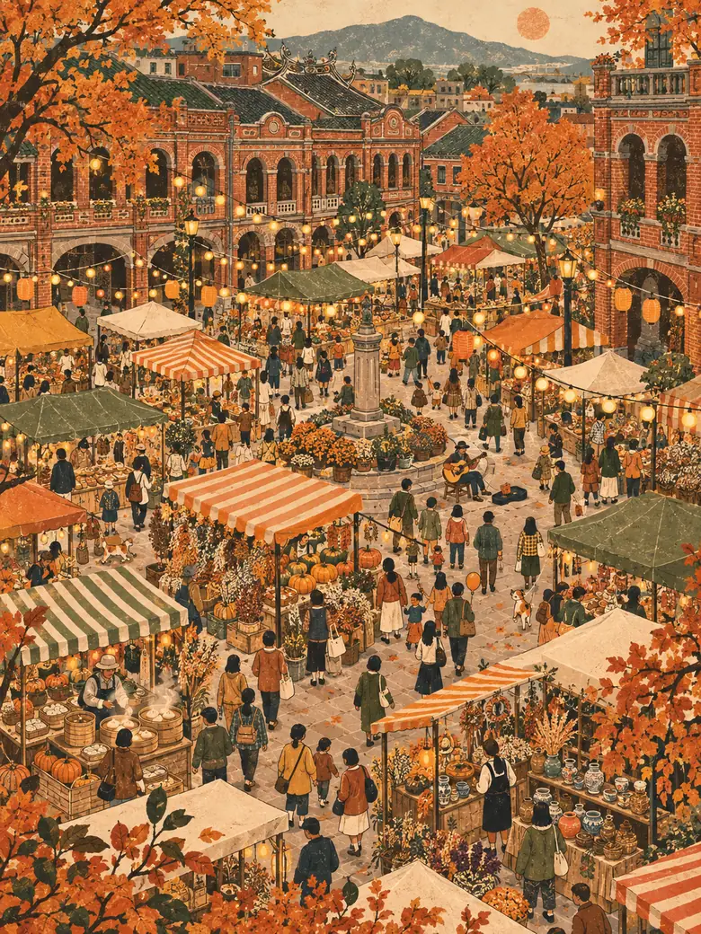
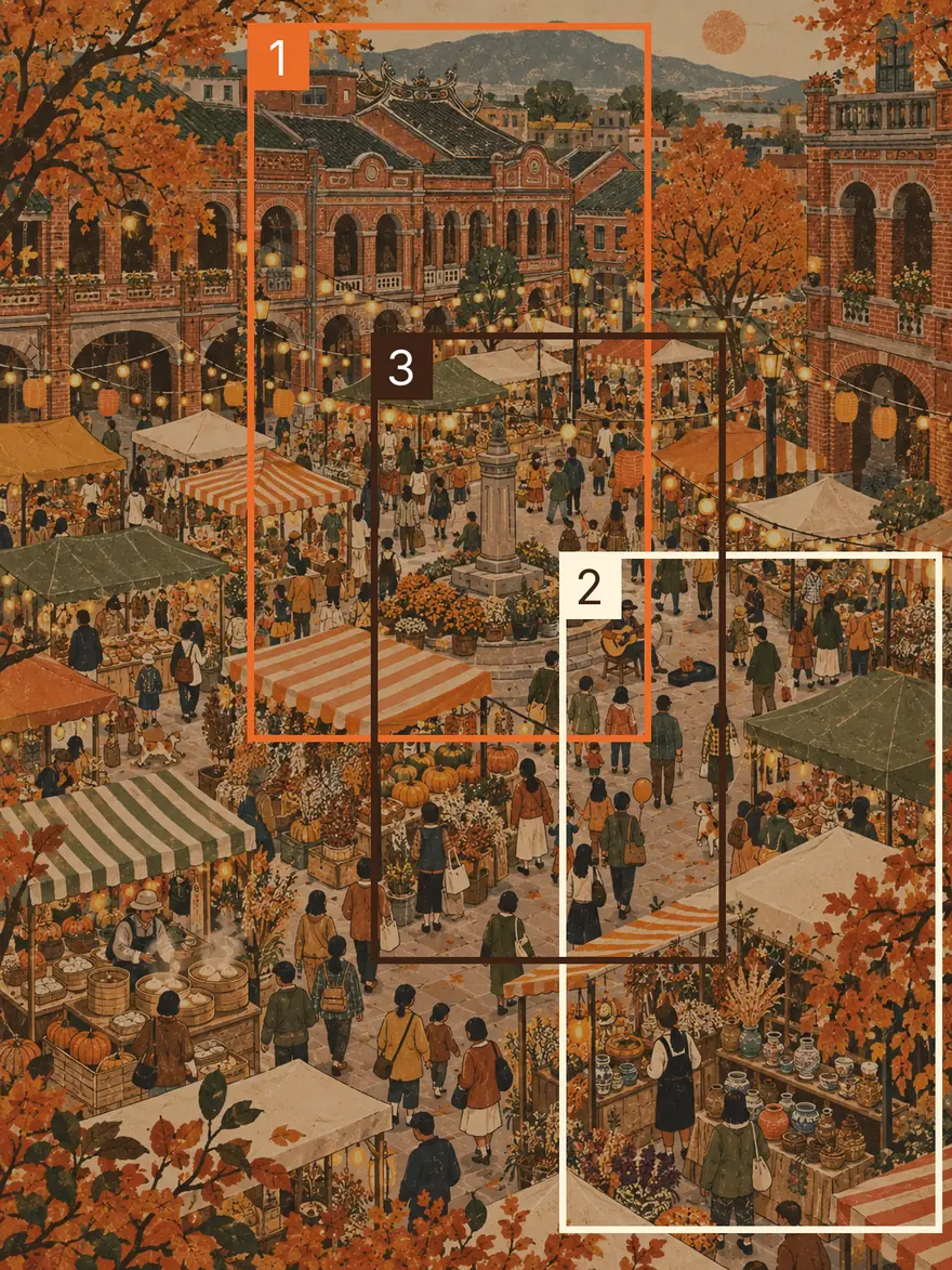
Most fliers look like notices because the illustration is a small decoration in a corner. We flipped that. ChatGPT painted the whole market first: red-brick old streets, stalls, crowds, string lights and autumn trees, all in one picture, with no text anywhere.
Paint a vertical 3:4 illustration: [the event scene, e.g. an old-town market on an autumn evening], seen from above, with [venue features, e.g. red-brick old buildings, a square, a fountain], lots of stalls and crowds, and [mood details, e.g. string lights, falling leaves].
Style: hand-drawn illustration in a warm palette [pumpkin orange, brown, cream, a touch of green] with a printed, grainy texture.
Fill the whole frame, no white border. No text, sign lettering or logos anywhere in the picture.
04Step 3: open Claude Design, attach the illustration and paste this prompt
- Open claude.ai/design (or call up Claude Design in a Claude chat) and start a new project.
- We picked the "Flier" template. Official pages don't list the templates and names may change, so if you can't find it, pick one for fliers or posters.
- Attach the illustration from step 2.
- Paste the prompt below, replace the [ ] parts with your event details and send.
Make a portrait A4 flier for "[event name]", [dates]. Reference direction: the attached full illustration is the main visual and fills the whole page; set the event name vertically and very large, with the date as the second-biggest thing; keep only four lines of details: time, place, three highlights, [entry info]. Then use different crops of the same illustration to make 3 Instagram stories (1080×1920): event teaser, [line-up or programme], 3-day countdown. All text in Traditional Chinese, no grey placeholder boxes.
For the autumn market, this is what we actually pasted (in Chinese; translated here):
Make a portrait A4 flier for "Taichung Old Town Autumn Market", 11.7–11.8. Reference direction: the attached full market illustration is the main visual and fills the whole page; set "Autumn Market" vertically and very large, with the date as the second-biggest thing; keep only four lines of details: time, place, three highlights, free entry. Then use different crops of the same illustration to make 3 Instagram stories.
05Step 4: check 3 things: vertical title, date second, four lines only
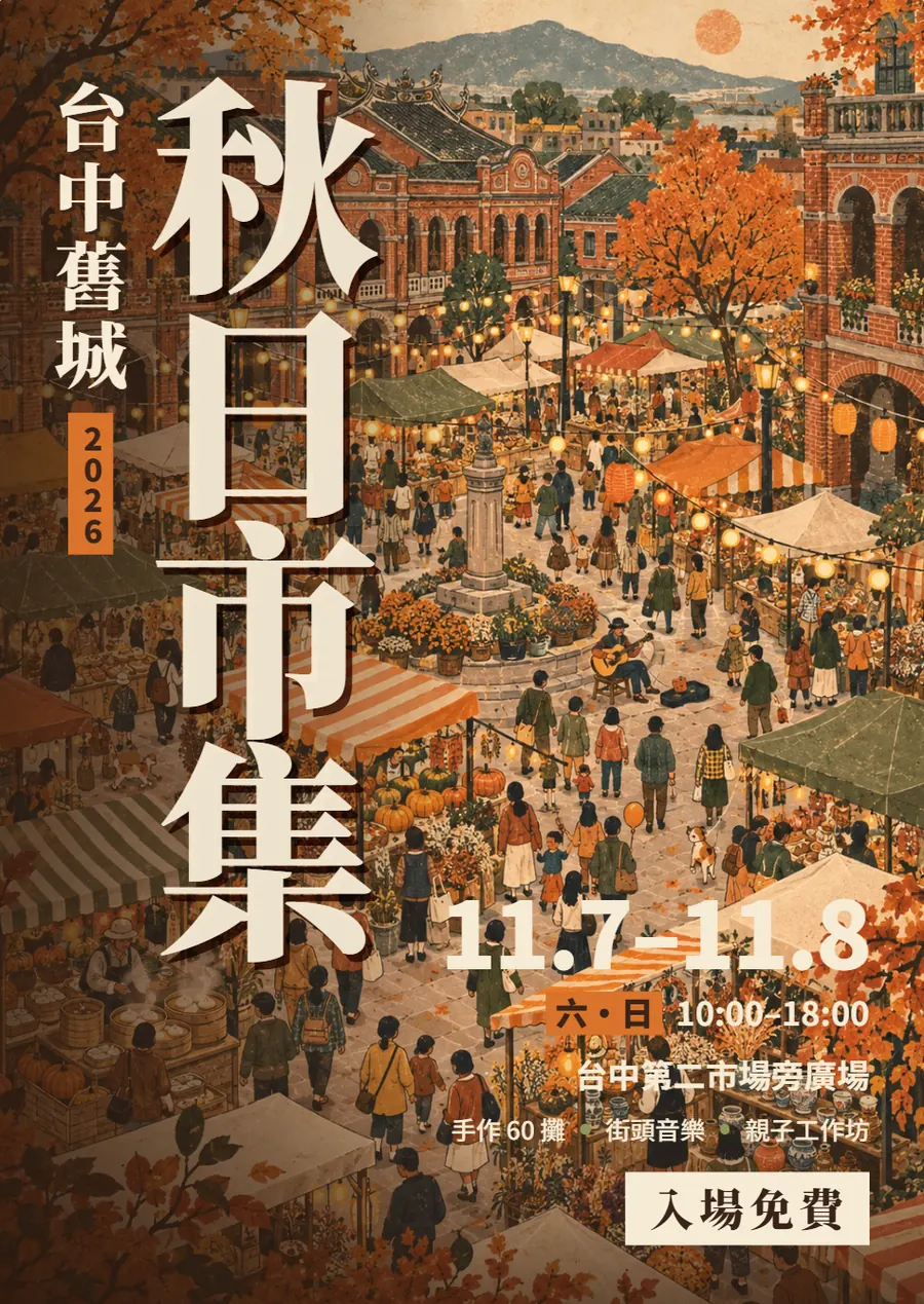
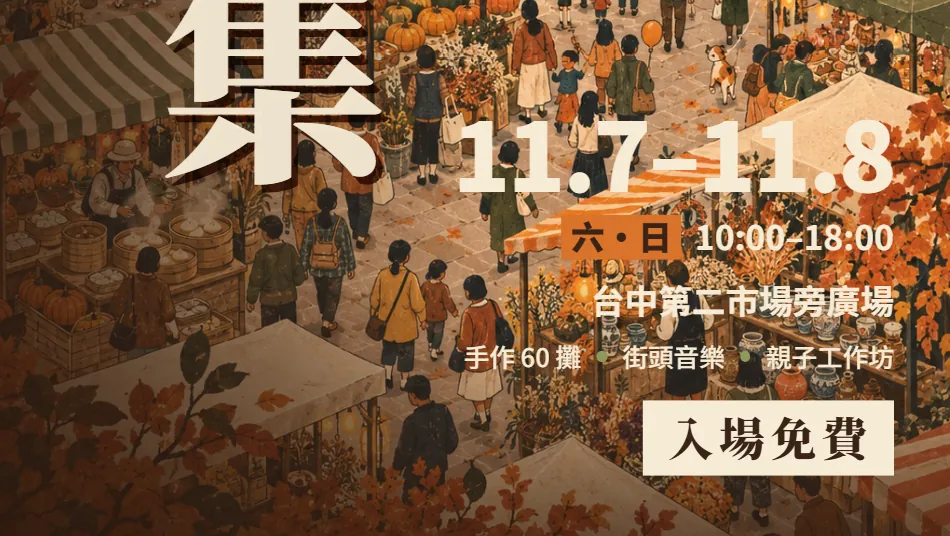
When the flier comes back, don't start on colours yet. Check these 3 things first. They are what make it read as a poster, not a notice.
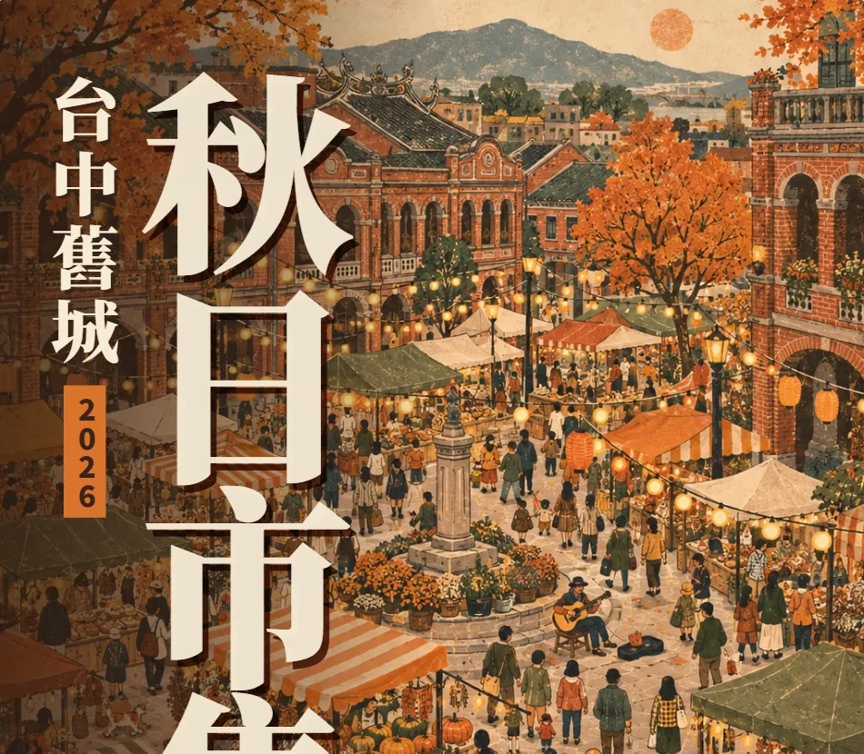
The date, 11.7–11.8, is the second-biggest text on the page. Below it there are only four lines: the time (Sat–Sun 10:00–18:00), the place, three highlights (60 craft stalls, street music, family workshops) and free entry.
- Shrink it to phone size: can you still read the title, the date and the entry info?
- Rank the type sizes: the title is biggest, the date second, everything else small.
- More than four lines of details? Cut. Put sign-up steps and small print behind a QR code or in your post.
06Step 5: make the 3 stories by cropping, not by shrinking the flier
A lot of people shrink the A4 flier into a story and the text becomes unreadable. Our 3 stories are all the same illustration, cropped in different places: the teaser uses the red-brick street, the line-up uses the pottery stall and the countdown uses the busker in the square.
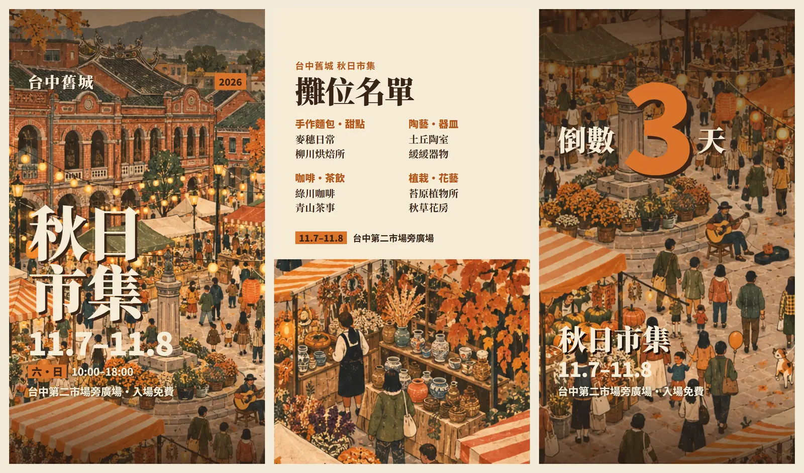
- Teaser: title, date and place, in the same type as the flier.
- Line-up or programme: the text-heavy one. Put a cream panel on top and let the illustration show below. We used 4 categories with 2 stalls each and left room to breathe.
- 3-day countdown: one giant number and as few other words as possible.
07Step 6: one round of fixes, then export
Our first version wasn't perfect. The line-up story had a dark overlay and 15 names crammed in, the bottom gradients were so heavy they muddied the orange, and the title had a generic soft drop shadow. One round of fixes did it. Say exactly which pieces to change, what to change and what to leave alone.
Change the stories only; leave the flier alone:
1. Story 2 [stall line-up]: make the top a solid cream panel with [4] categories of [2] names each; let the illustration show underneath, without darkening it.
2. Stories 1 and 3: keep the bottom gradient to the lowest 15% only, at most 30% dark, and keep the illustration's original colours.
3. Give the title a hard-edged [brown] shadow offset down and to the right, like riso misregistration, instead of a soft drop shadow.
- The officially listed exports are PDF, PPTX, standalone HTML, or sending it to Canva.
- For print: export a PDF for the print shop.
- For Instagram stories you need image files: send it to Canva and download PNGs from there, or convert the PDF to images.
08Good to know
- The Taichung Old Town Autumn Market is a fictional demo event. Taichung Second Market is a real place, but the dates, the 60 stalls and the stall names (麥穗日常, 柳川烘焙所 and so on) are invented. ChatGPT made the illustration; Claude Design made the layout.
- To print at A4 the illustration needs enough pixels: 300 dpi means about 2480×3508 px. Ours is only 1086×1448 px, around 130 dpi at A4, so it would look soft. Upscale the illustration first, or print smaller, such as A5.
- Ask your print shop whether they need bleed. Usually it's 3 mm extra per side, so A4 becomes 216×303 mm; keep important text at least 3–5 mm inside the trim.
- Screens are RGB and print is CMYK. Bright oranges can print darker, so print one proof and check the colour.
- Use fonts licensed for commercial use, such as Noto Sans TC or Noto Serif TC (SIL OFL).
- The standalone claude.ai/design site stays open until 14 December 2026, and Claude Design already works in Claude chats. Export a copy of any project that matters.