Make a newsletter that looks like a small magazine with Claude Design: references, photos, one prompt, light and dark
A newsletter needn't be plain text. Pick Pinterest refs, make photos in ChatGPT, let Claude Design lay out a 600px HTML email plus a dark version, then send.
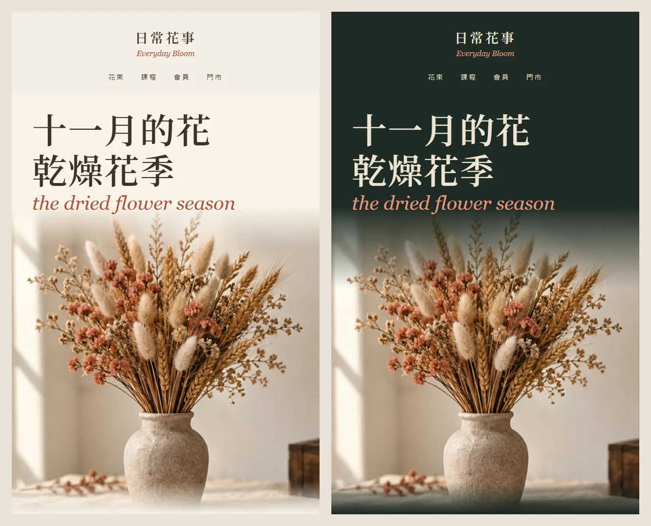
Why does other people's Claude-made newsletter look like a small magazine while yours is a plain-text email? The platform template isn't the problem. You didn't give Claude references and photos first. In this guide we used Claude Design to make a November issue for a fictional florist, Everyday Bloom (日常花事), in a light and a dark version. Every image below is a real Claude Design result; the photos were made in ChatGPT first.
01Open Claude Design (1 minute)
- Go to claude.ai/design and sign in with your Claude account. Claude's official article of 8 October 2026 says Design is out of beta and on every plan, including Free.
- You can also use Claude Design straight inside a normal Claude chat. The standalone claude.ai/design site stays open until 14 December 2026.
- Start a new project and pick the "HTML email" template.
- Don't type yet. Get your references and photos ready in the next two steps.
- Claude Design (official page) — Free plan included
02Step 1: find 3–5 references on Pinterest and write down what makes them good
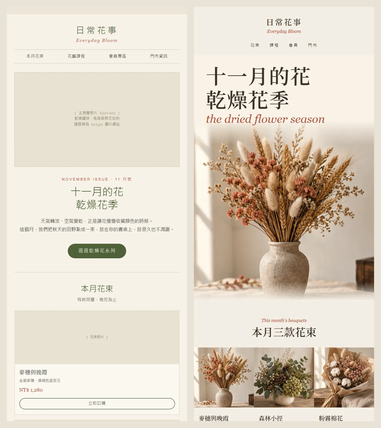
Without references and photos, Claude Design gives you a tidy email that still looks like a template: grey placeholder boxes where the photos go and a small centred title. With references and photos, the same email turns into a magazine.
- Search Pinterest for "florist newsletter email design editorial". For another business, swap florist for your trade, such as cafe or bakery.
- Pick 3–5 you like.
- Write one line per email on what makes it good. Plain words are fine; write what you see.
After looking at 5 florist newsletters, these are the lines we wrote down. All of them went into the prompt:
- The photo is the star: the hero is a real bouquet photo, not a block of colour.
- One big serif headline with an italic English accent. Body text stays small.
- One cream ground and one accent colour for the whole email, no card borders, photos butting against each other.
- Discounts, dates and prices sit together in one frame; everything else is white space.
03Step 2: make the photos in ChatGPT first
Most of the magazine feel comes from the photos. We made 4 in ChatGPT first: 3 bouquets for the hero and product shots, and 1 wreath-making photo for the workshop section.
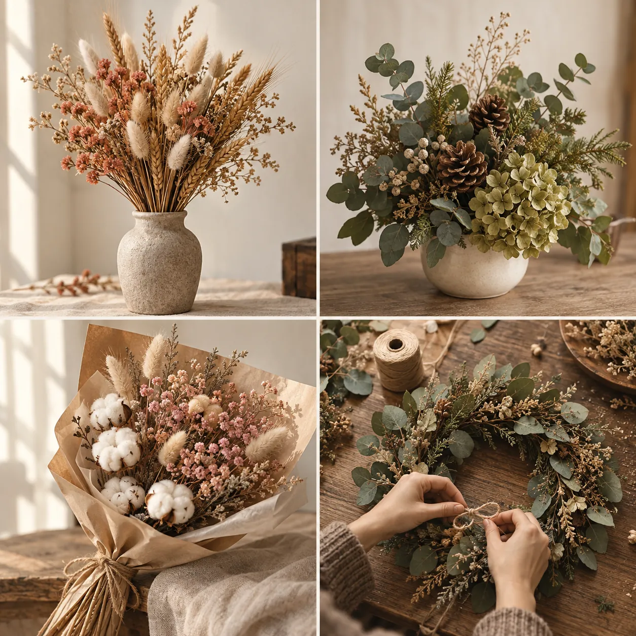
Shoot a product photo of [product]: [how it's arranged, e.g. a dried-flower bouquet in a clay vase], on [setting, e.g. a wooden table], warm natural light, cream background, square. No text anywhere in the image.
Use the same light and colour tone for the next [3] photos.
04Step 3: attach the photos and paste one prompt
Go back to your HTML email project in Claude Design, attach the photos, then paste this prompt. The lines you wrote in step 1 become the "reference direction" in the prompt.
Make the [month] issue of the [brand name] newsletter, 600px wide. Reference direction: a real photo as the hero with one big serif headline above it; one cream ground plus one [accent colour] for the whole email; photos butt against each other with no frames; discount, code and expiry date all in one ticket block. Also make a dark version of the same email (deep green ground, cream text). All text in Traditional Chinese, no grey placeholder boxes.
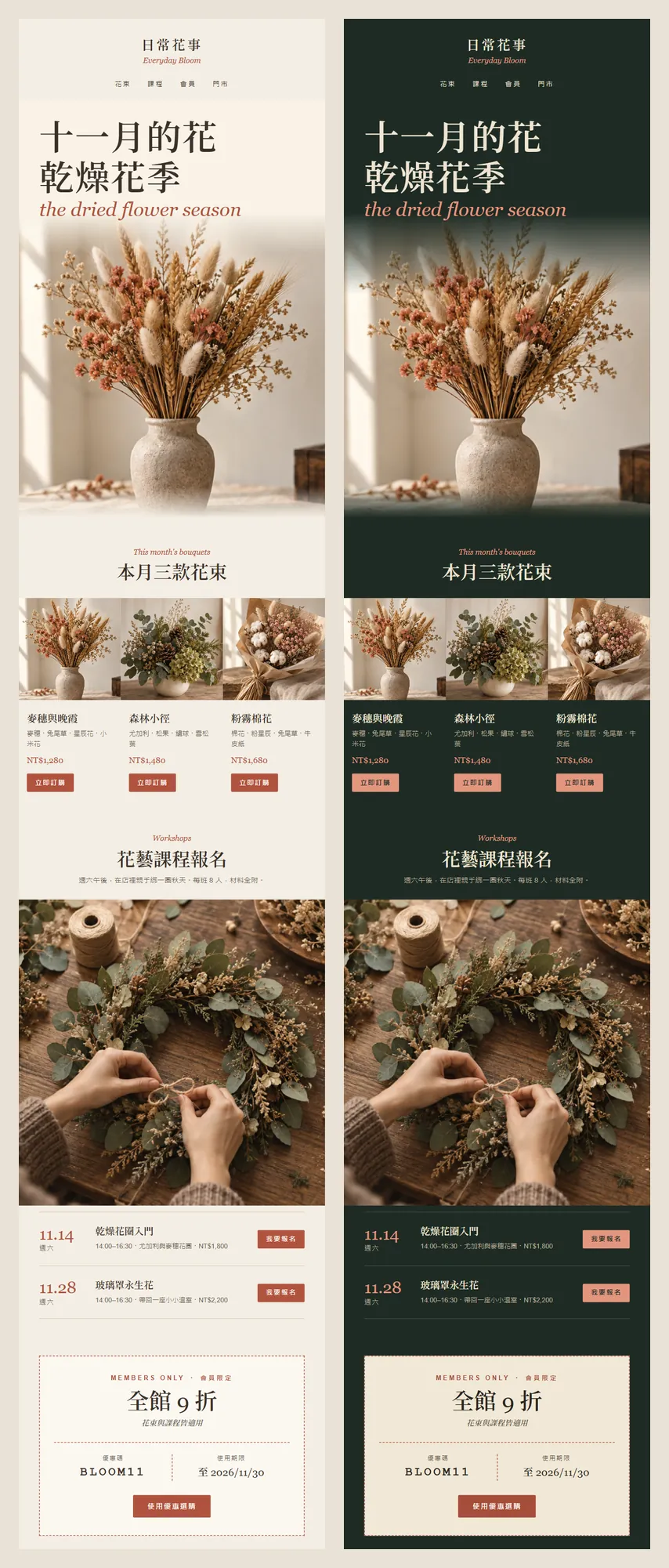
What comes back is a complete newsletter: the shop name and menu at the top, then the hero, this month's three bouquets, workshop sign-ups and a members' offer, with social links and an unsubscribe link at the bottom.
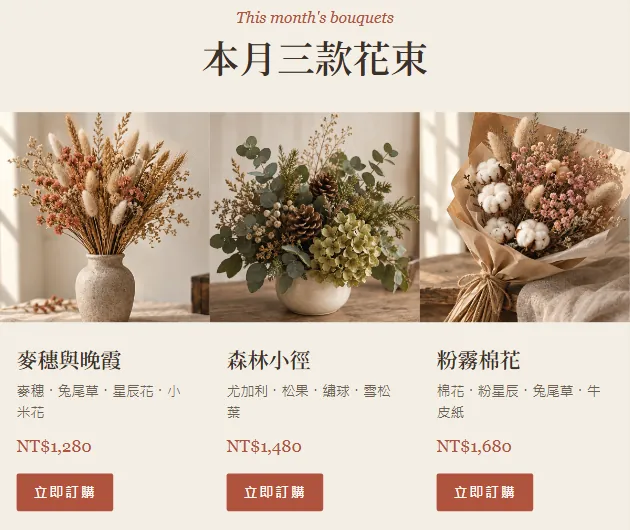
Claude also noted in the project that on narrow screens the three bouquet cards stack into a single column, so they don't get squashed on a phone.
05Step 4: read it top to bottom and fix one thing at a time
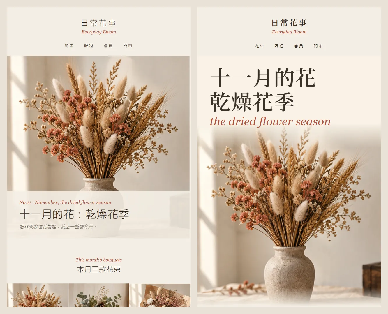
The first version isn't always right. In ours, the headline sat under the photo in a fairly small size, so it didn't feel like a magazine cover. Moving a big headline above the photo, with an italic English line, gave it the cover look.
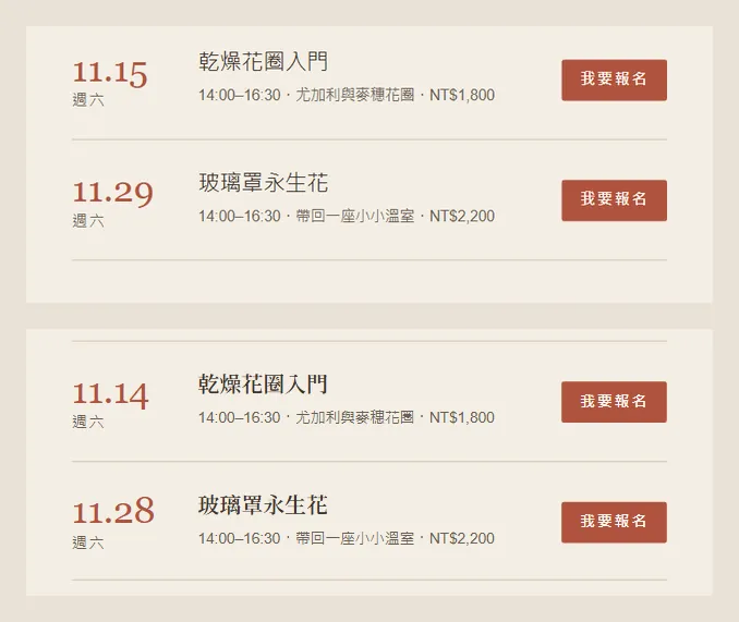
Check the dates yourself too. The first version listed the workshops on 11.15 and 11.29 as Saturdays, but in 2026 both are Sundays. We changed them to 11.14 and 11.28, which really are Saturdays.
Only change [the hero section]: [make the headline two lines of big serif type above the photo, with an italic English line below]. Don't touch the other sections or the dark version's layout.
06Step 5: the same email in a dark version
The last line of the prompt, "also make a dark version of the same email", got us two versions from one prompt. The photos stay exactly the same; the ground turns deep green and the text turns cream.
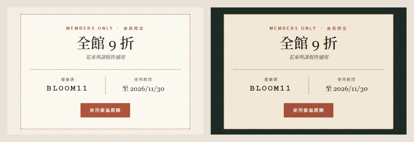
In the dark version the offer ticket stays cream, like a real ticket lying on green, which makes it stand out even more.
07Step 6: export the HTML and put it into your email tool
- Export a standalone HTML file from Claude Design. The other official export formats are PDF and PPTX, and you can send it to Canva.
- Replace the photos with image URLs you host online (starting with https). Readers can't see photos that only live on your computer.
- In Mailchimp, for example: Campaigns → Email templates → Code your own, then paste the code, or upload the file with Import HTML.
- Use Preview and Test to send yourself a test email, and open it on both a computer and a phone.
- Mailchimp: Import a Custom HTML Template — How to paste or upload an HTML newsletter
08Good to know
- Everyday Bloom (日常花事) is a fictional brand. The layout was made by Claude Design and the photos by ChatGPT; the bouquets, prices, workshop dates and the BLOOM11 code are demo content.
- Email apps don't always support web fonts. Mailchimp's help page says an unsupported web font is replaced with a standard font, so the big serif headline may look different in some inboxes.
- You can't use JavaScript or forms in a newsletter; most inboxes won't run them. Link buttons to your website for sign-ups and orders.
- Background images don't show in every inbox. Don't put important text only on a background image.
- Keep the unsubscribe link. Mailchimp requires the *|UNSUB|* tag in every campaign, and Google says senders who send more than 5,000 messages a day to Gmail must support one-click unsubscribe on marketing email and show a clear unsubscribe link in the body.
- The standalone claude.ai/design site stays open until 14 December 2026, so export important projects first.
Sources
- Claude: Docs, Slides and Design out of beta, on every plan including Free (8 Oct 2026)
- Claude Design product page
- Mailchimp: Import a Custom HTML Template
- Mailchimp: Limitations of HTML Email (width, fonts, JavaScript)
- Google: Email sender guidelines (unsubscribe rules)
- Can I email: prefers-color-scheme support