Building a site with Claude? Get a wireframe first, then the final: two prompts for a homepage that doesn't look AI-made
Don't ask for the finished site in one go. Get a greyscale wireframe with a reason for every block, pick a direction, then build the final with real photos.
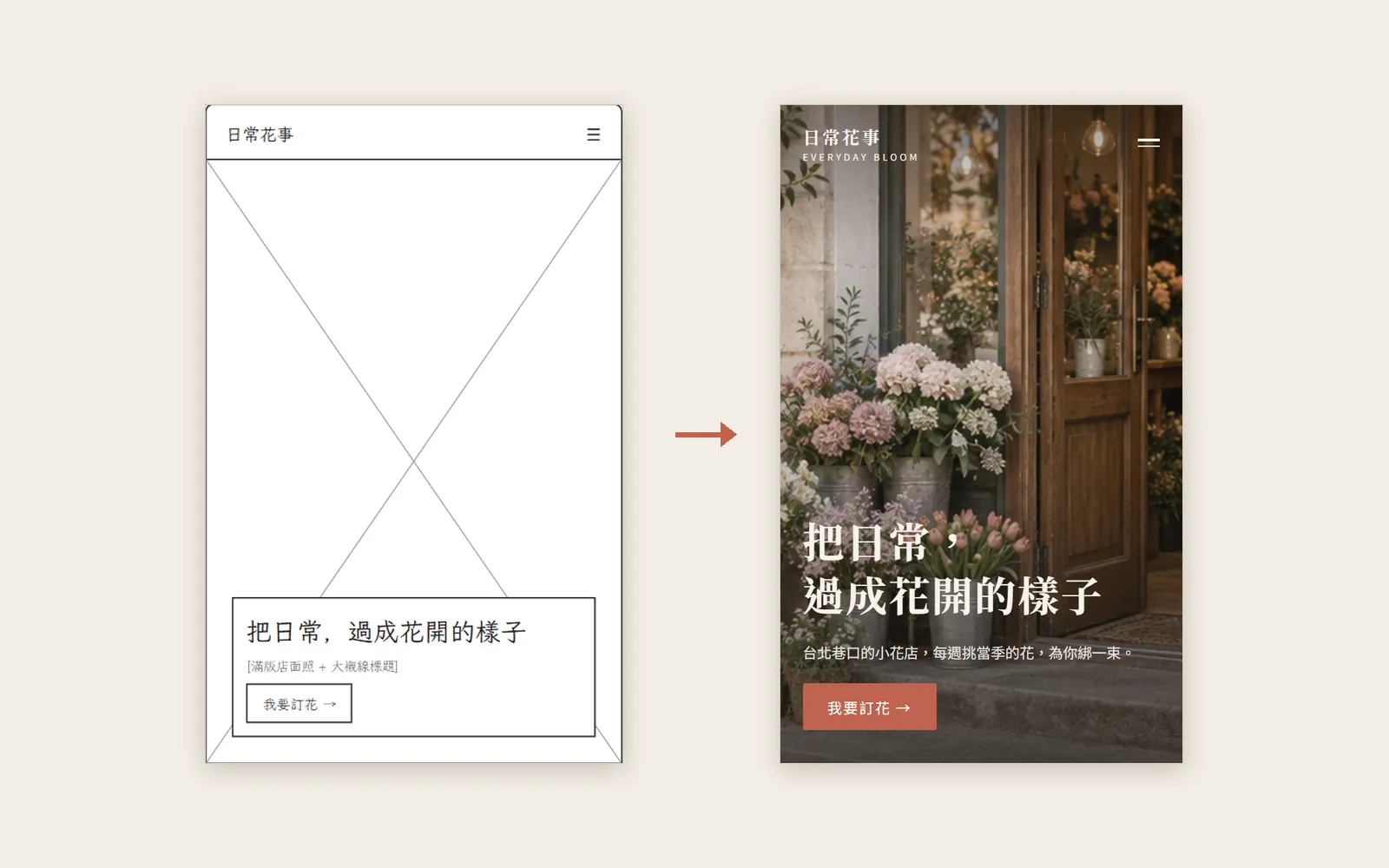
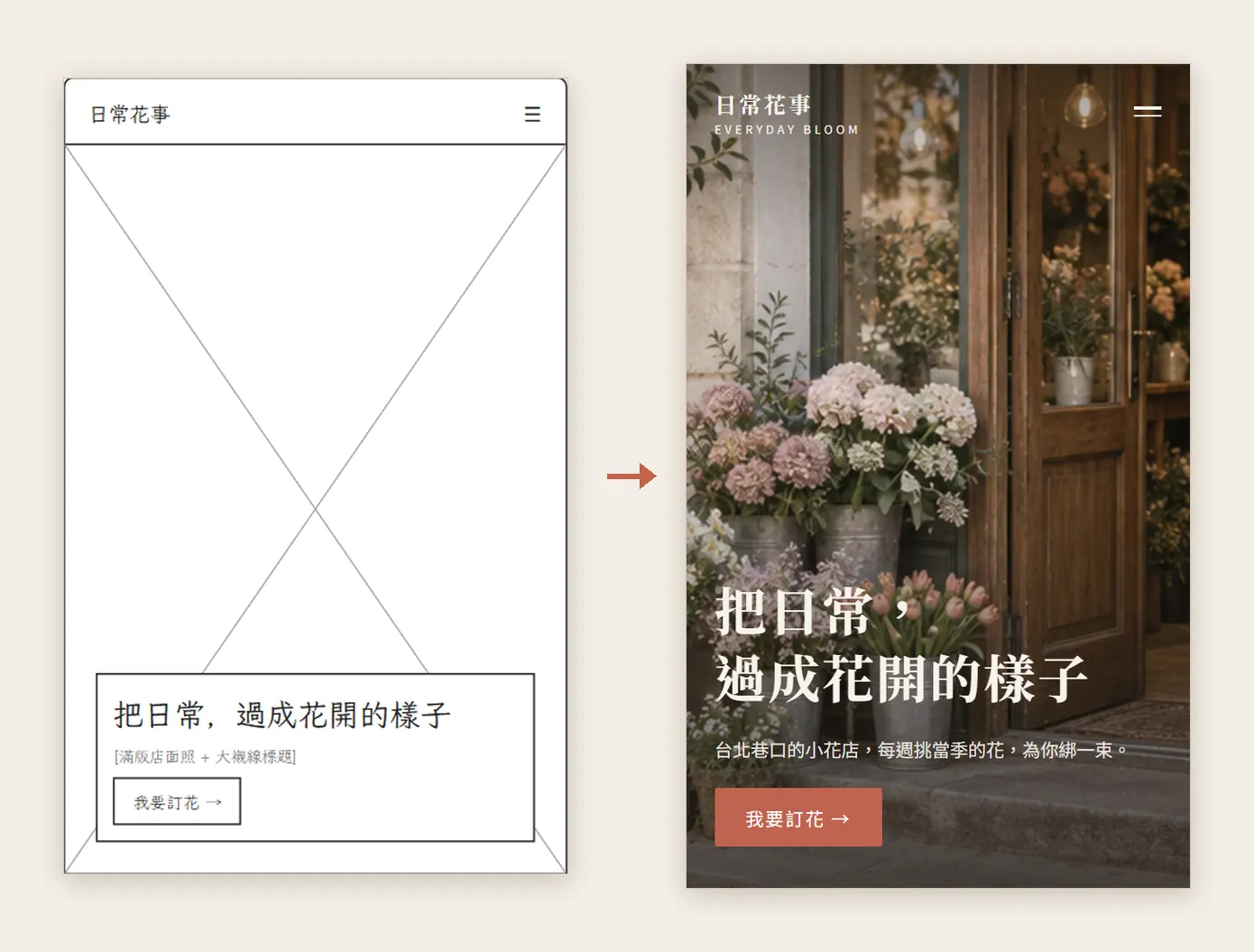
When people ask AI for a website, the first line is often "make me a nice homepage". Colours, photos and layout all get decided at once, and the result looks like every other AI site. This guide changes the order: first a greyscale wireframe, and only once the structure is right, the finished page. The demo is a fictional Taipei flower shop, "日常花事 Everyday Bloom". Every wireframe and final page below was really made by Claude Design, and the photos were generated with ChatGPT.
01First: what a wireframe is and why it comes first
A wireframe is the skeleton of a website: grey boxes and text only, with a crossed-out box wherever a photo will go. It answers three questions: which blocks there are, in what order, and where the buttons sit.
Ask for the finished page in one go and Claude has to choose structure, colours, fonts and photos all at once; if any of them is off, you redo the whole page. Ask for a wireframe first and it only has to think about structure, and you can fix the order before any colour goes on.
02Prep: look at references, then open Claude Design
- Search Pinterest for websites in your field; for a flower shop, try "florist website homepage design".
- Pick 3 to 5 you like and write one line on what makes each one good.
- Open claude.ai/design, sign in to your Claude account and start a new project. We picked a template made for wireframes; template names may change, and a regular project works too.
The notes we wrote for the flower shop: the hero is a real bouquet photo, not a block of colour; the headline is one big line in a serif font; the page uses one cream background and one accent colour; facts like dates and prices sit together in one block, with space everywhere else. You can paste lines like these straight into your prompt later.
Claude's official page says Claude Design is included in every plan, including Free. The standalone site at claude.ai/design stays open until 14 December 2026, and Claude Design already works inside regular Claude chats too.
- Claude Design official page — Plans, claude.ai/design dates and export formats
03Step 1: the first prompt asks for a wireframe only
Draw a homepage wireframe for [shop name]: give 3 directions, greyscale, no colours, crossed-out boxes in place of images, and a short note beside each block saying why it is laid out that way. All text in [language].
What we actually pasted (in Chinese) was: "Make a homepage wireframe for 日常花事, a small Taipei flower shop: greyscale, no colours, crossed-out boxes where the images go, and a short note beside each block saying why it is laid out that way. Give 3 directions."
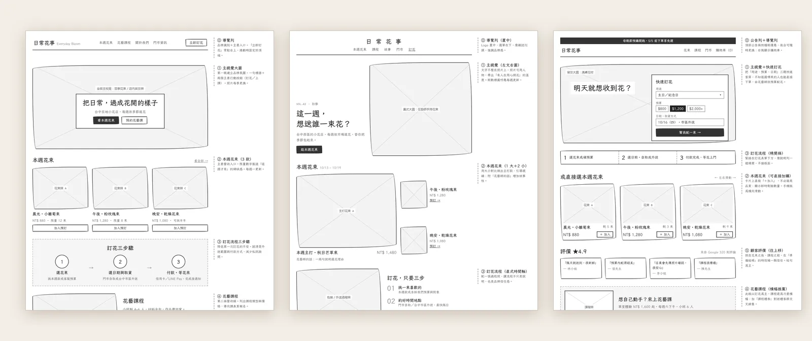
How they differ: the classic stack runs hero, this week's bouquets and the ordering steps straight down the page; the magazine layout mixes big and small photos like a magazine spread; order first puts a quick order form in the very first screen.
04Step 2: read its reasons and pick a direction
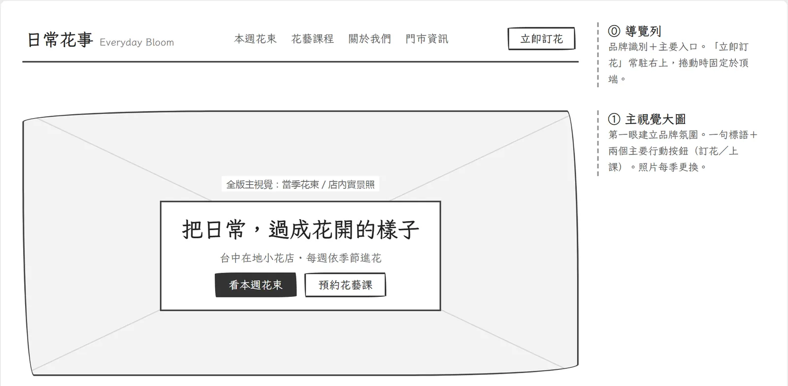
The small notes beside each block are the most useful part of this step. For the hero image, Claude wrote that it sets the brand mood at first glance; for this week's bouquets, that this is the main revenue entry point, with limited quantities creating an "only this week" feeling.
- Is the first thing customers want to do (order, book, check prices) visible in the first screen?
- Do you agree with the reason for each block? If not, tell Claude which block to change.
- Is there a block nobody would miss? Remove it and the page gets clearer.
- Look again at phone width and check the order still flows.
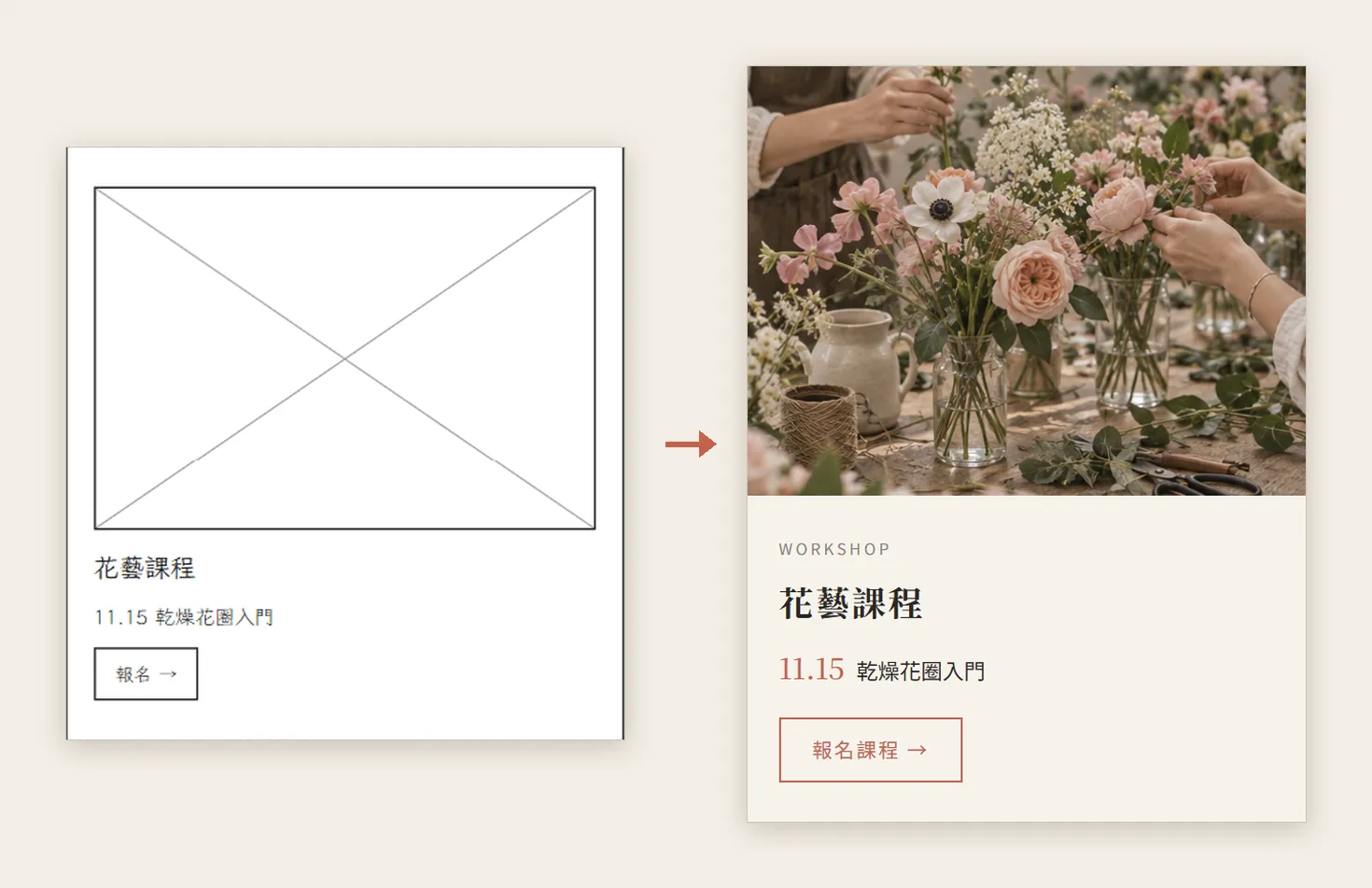
We picked A, the classic stack. The whole page has just six blocks: hero, this week's bouquets (three of them), three-step ordering, flower workshop, visit the shop, and the footer.
05Step 3: generate the photos in ChatGPT first
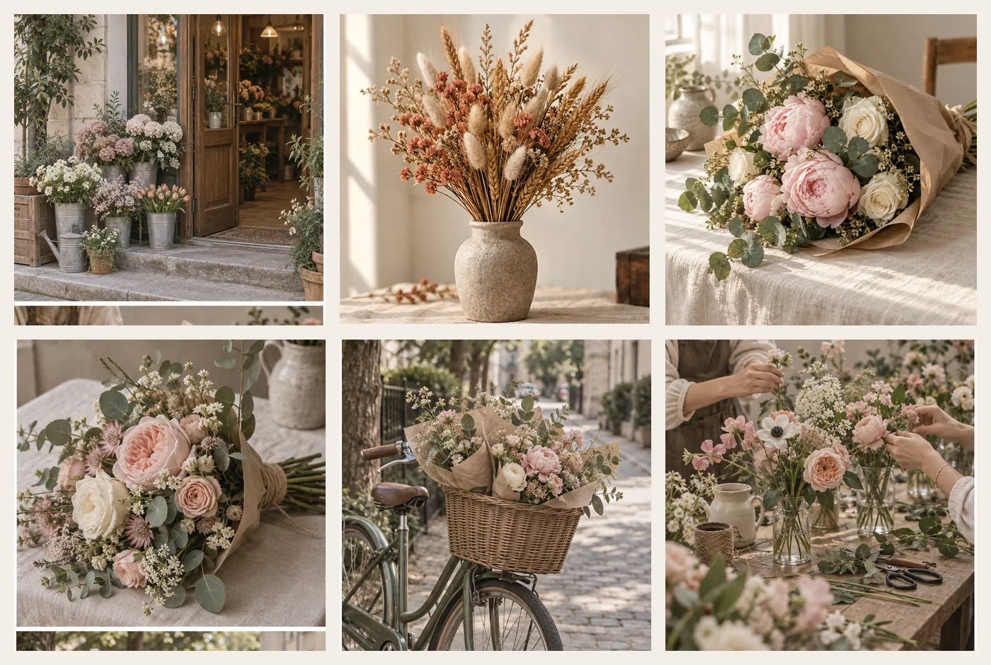
Every crossed-out box in the wireframe is a photo you need to prepare. Counting the boxes in our wireframe gave six: the shop front, three bouquets, bicycle delivery and the workshop.
Generate a photo of [the shop front / a product / a service] for [shop name]: [subject and setting], [warm natural light, cream and pink tones], square format, no text in the image, no visible faces.
06Step 4: the second prompt builds the final from the wireframe
Go back to the same Claude Design project, attach the photos and paste the second prompt. The key phrases are "keep the structure" and "save as a new file".
Build the finished homepage from the direction [A / B / C] wireframe: keep the structure and block order exactly the same, replace every crossed-out box with the photos I attached, use [main colour + cream] and serif headlines. Save it as a new file and don't change the wireframe.
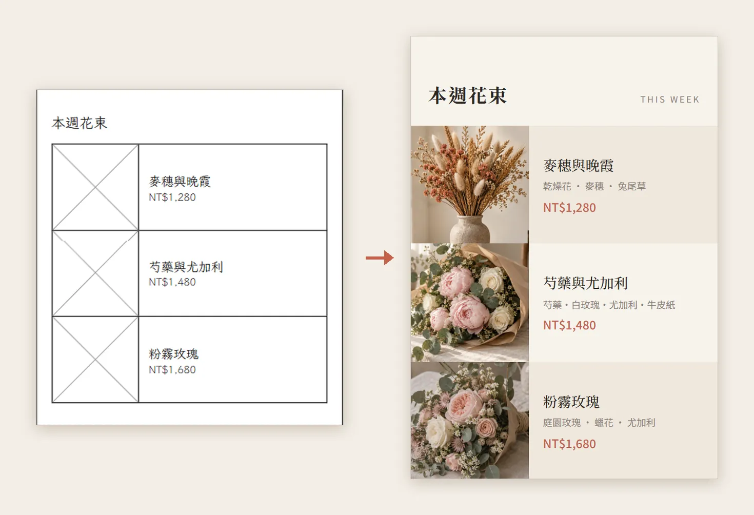
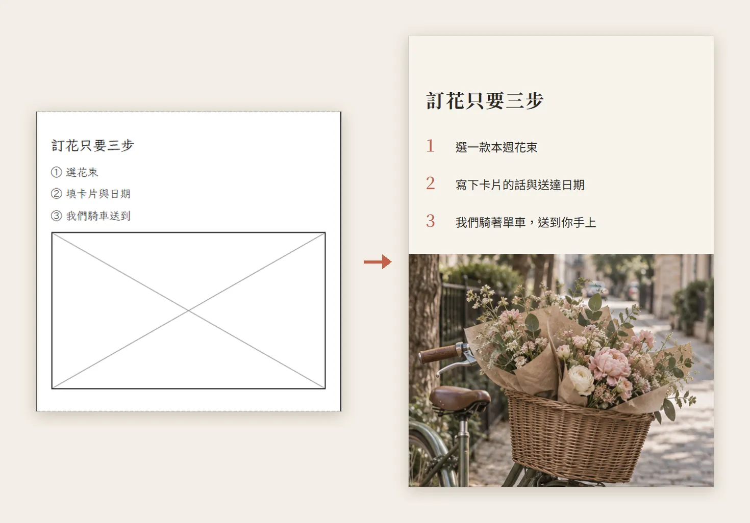
Look closely and the copy got fuller: the wireframe says "choose a bouquet", the final says "choose one of this week's bouquets". The words can change; the blocks and their order can't.
07Step 5: put the two files side by side and check block by block
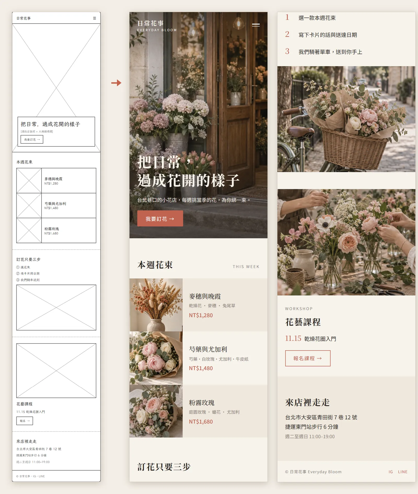
- Is the block order the same as the wireframe?
- Has every crossed-out box been replaced with your photo? Is any photo used twice?
- Are the counts the same, e.g. still three bouquets?
- Are the main buttons (order now, book a class) where they were?
- Have the address, opening hours and prices been replaced with your real details?
08Good to know
- "日常花事 Everyday Bloom" is a fictional brand; the address, prices and workshop date on the page are for the demo only, not a real shop.
- The wireframes and the final page were made by Claude Design and the photos by ChatGPT. This was done in October 2026; the interface and template names may change.
- Before you go live, swap the AI photos for real shots of your shop so customers don't feel misled.
- The officially listed export formats are PDF, PPTX and standalone HTML, plus sending to Canva. Turning it into a live website still needs hosting.
- Use Pinterest references for direction only; never put someone else's design or photos on your site.