Turn Claude into a logo designer: a free skill that builds a full identity in 4 steps
A free, open-source skill makes Claude ask questions, write a brief, test 3 directions at 16px, then export mono, favicon, app icon and a board.
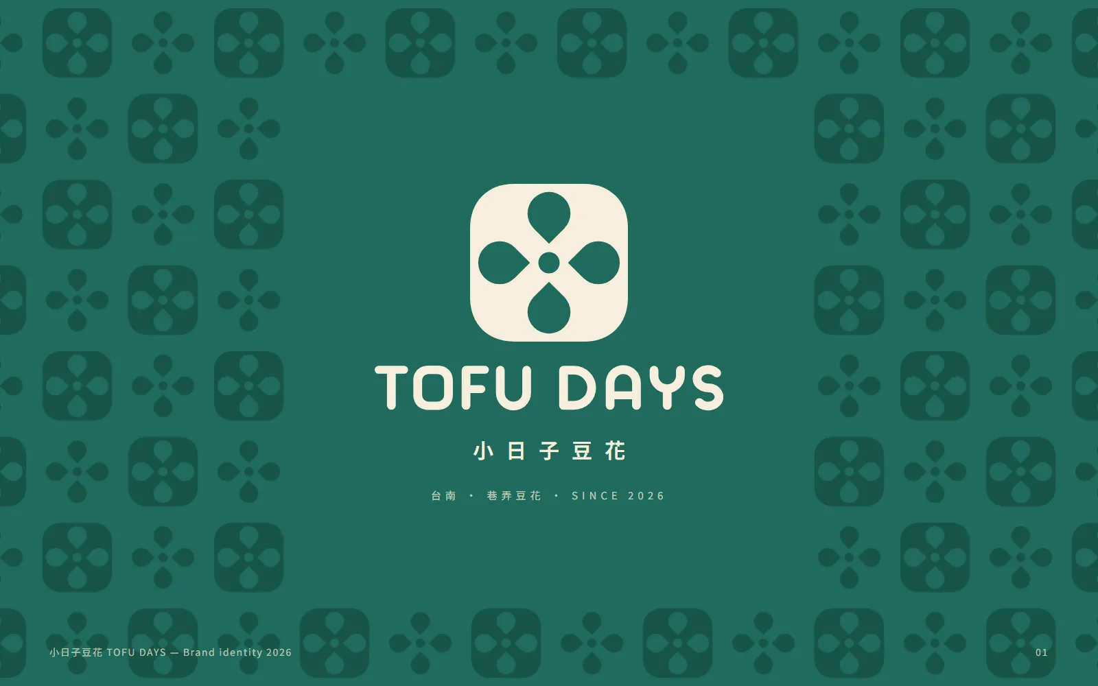
Does Claude give you a font and an icon when you ask for a logo? Your prompt isn't too short. Claude is missing a designer's process. In this guide we used the free, open-source Logo Design Skill to build a full identity for a fictional tofu-pudding shop in Tainan, TOFU DAYS. Every image below was made by Claude with this skill.
01Install the Logo Design Skill (3 minutes)
- Open Claude Code.
- Type: /plugin marketplace add kaankiziltug/logo-design-skill
- Then type: /plugin install logo-design@logo-design-skill
- Tell Claude: "Design a logo for [brand name]". Mentioning a logo, wordmark, favicon or app icon triggers it.
On claude.ai or Claude Desktop, download logo-design.zip from the GitHub Releases page and upload it under Settings → Capabilities → Skills. It uses the open Agent Skills format, so it also works in Gemini CLI, Codex CLI and Cursor.
- Logo Design Skill (GitHub) — MIT licence, free and open source
02Step 1: answer 5 questions and get a design brief
It doesn't start drawing straight away. It asks 5 questions in one go, then turns your answers into a design brief: who the audience is, how the brand should feel, what to avoid, where the logo will be used and what counts as success.
- Name and business: how is the name written? Upper or lower case in English? Is there a tagline?
- Audience: who must notice the brand, and where will they first see the logo?
- Brand adjectives: 3 to 5 words for how it should feel.
- Competitors and references: who should it not look like? Which logos do you like, and why?
- Constraints: colours to keep or avoid, where it will be used, and the deadline.
Design a logo for "[brand name]".
[One line: where it is, what it sells, who runs it]
Audience: [age, locals or tourists]
Feel: [3 to 5 adjectives]
Used on: [takeaway cups, paper bags, signage, Instagram avatar, business cards…]
Ask me questions first, write a design brief, then start the concepts.
03Step 2: list the category clichés and check 1,400+ real logos
Next it lists the most common clichés in your category and treats them as off-limits. For a tofu-pudding shop that means a bowl and spoon, steam lines, soybeans, wooden buckets, red brush lettering and smiling tofu cartoons.
Then it searches its built-in library of 1,432 real logos. A search for "cup" returned 5 results, all a cup with steam, so it decided to avoid bowls, steam, sun rays and blue. Finally it writes 10 one-line concepts, scores each on clarity, distinctiveness, simplicity, relevance and 16px legibility, and keeps the 3 strongest, most different ones.
04Step 3: 3 directions in black and white, tested at 16px
It builds all 3 directions (Day Block, Tofu Sunrise, Tile Flower) in black and white, shrinks them to 96px and 32px, and checks one-colour and reversed versions.
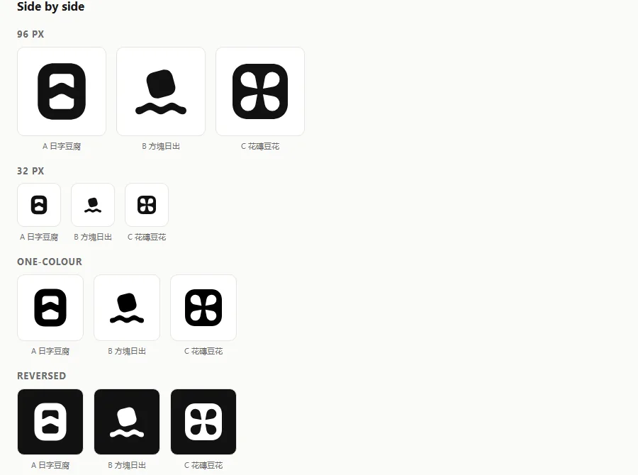
“Tofu Sunrise” was knocked out right here and replaced by a wordmark direction, “Wobble O”: the O in TOFU DAYS is a slightly tilted, wobbling block of tofu.
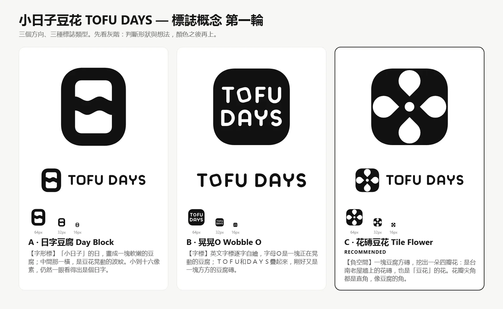
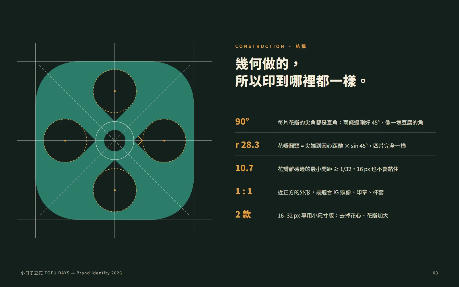
It also runs an SVG audit. The petal edges sat at 43.2° instead of a clean 45°, which reads as a mistake, so the tool flagged them and Claude fixed them.
05Step 4: pick a direction and get the whole set
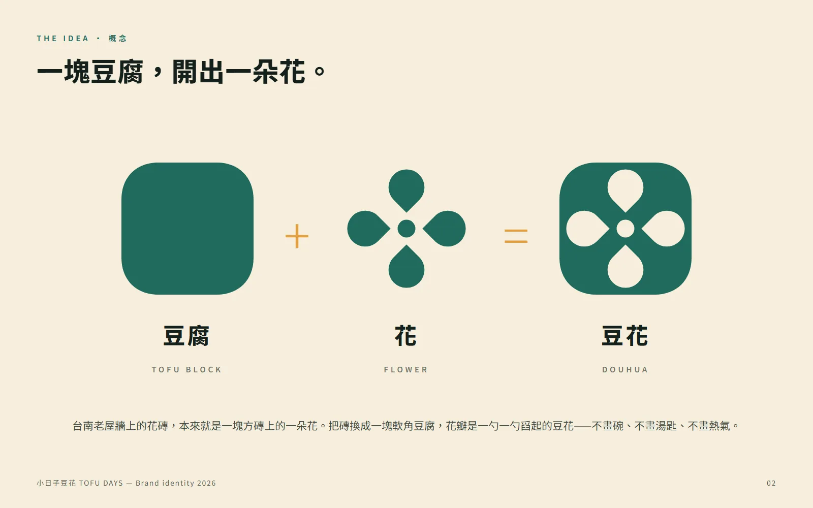
- Horizontal and stacked lock-ups, plus the symbol and wordmark on their own (all SVG).
- One-colour, reversed and small-size versions.
- Favicon (16, 32 and 48px plus .ico), app icon, maskable icon and site.webmanifest.
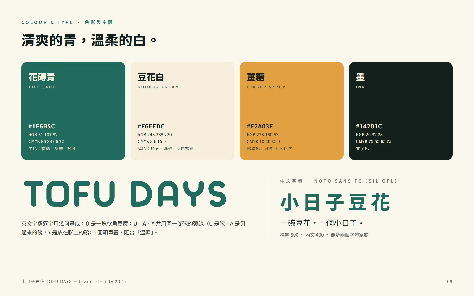
- Colour palette with HEX, RGB, CMYK and contrast ratios.
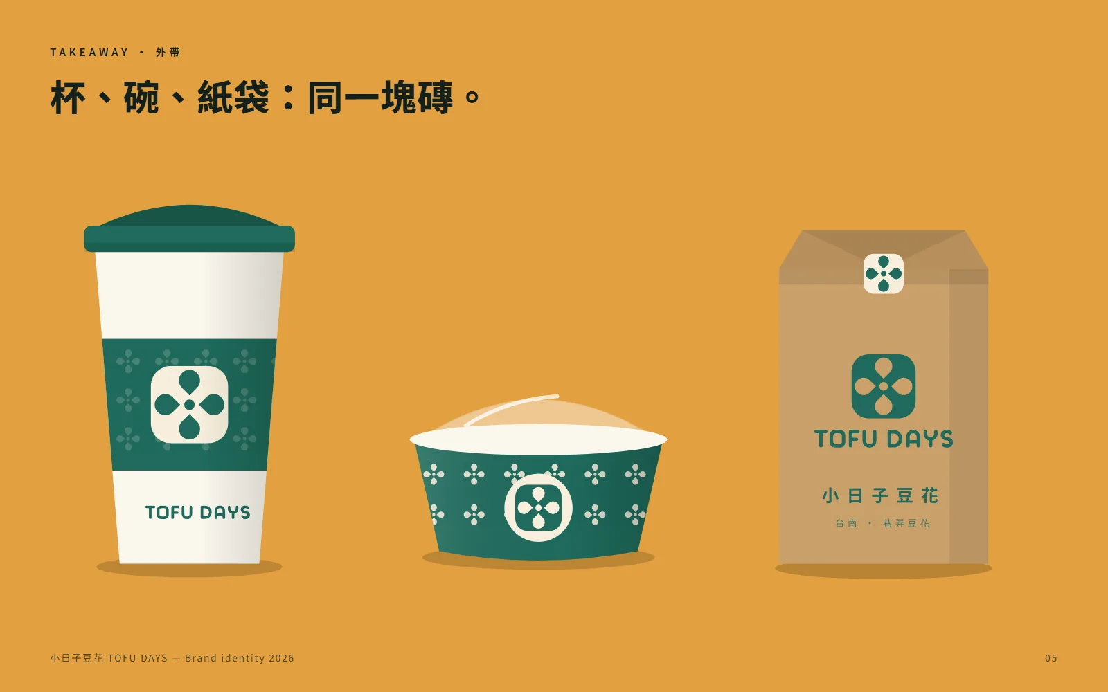
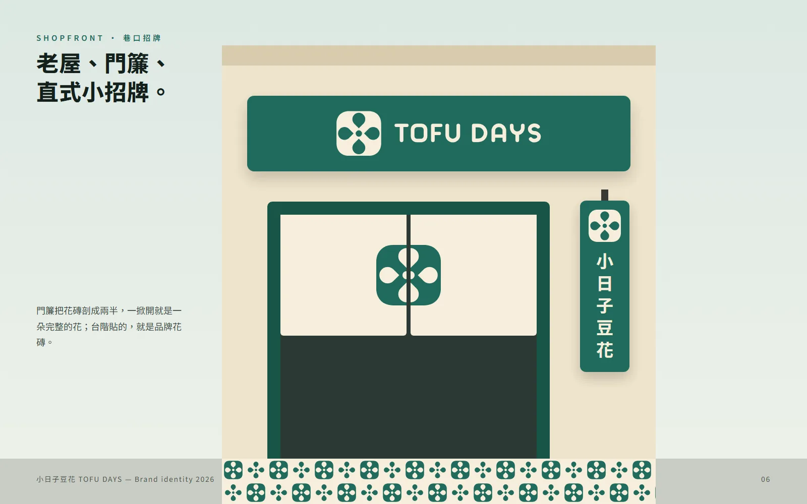
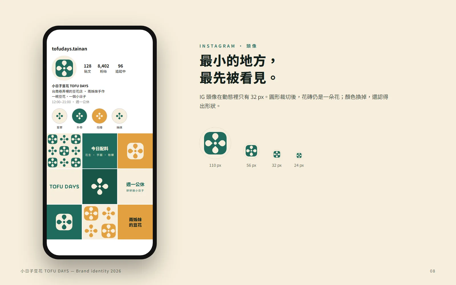
- Presentation board: the idea, the construction and mock-ups on cups, signage and Instagram.
06Good to know
- TOFU DAYS is a fictional brand; the whole identity was made by Claude with this skill as a demo.
- Before you use a logo for real, run a trademark search to make sure nobody else owns something similar.
- Use fonts licensed for commercial use, such as Noto Sans TC (SIL OFL).
- Check colours against a physical swatch before printing; screen colour and print colour differ.