Design an app without opening Figma: one Claude Design prompt, 6 clickable app screens
Use the Mobile app design template, name the brand, 6 screens and a style, and Claude Design draws a clickable app. Export PDF or PPTX, or send to Claude Code.
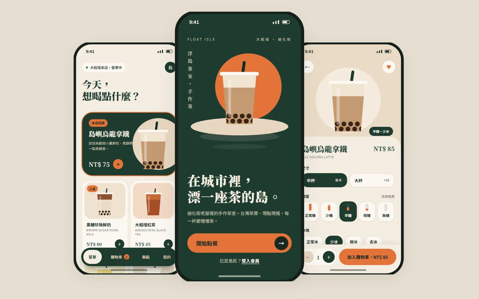
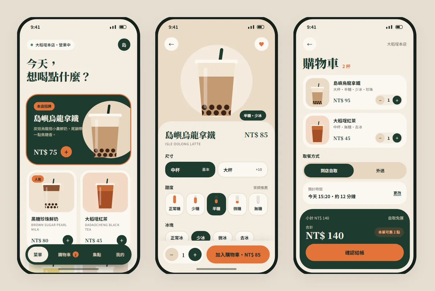
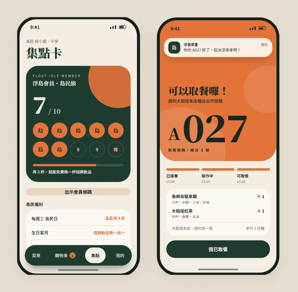
Other people draw app mock-ups with Claude while you're still dragging boxes around in Figma? Figma isn't the problem: your first draft can now come from one paragraph. In this guide we used Claude Design's Mobile app design template to build 6 ordering-app screens for a fictional bubble-tea shop in Taipei's Dadaocheng, FLOAT ISLE (浮島茶室): menu, customisation, cart, stamp card and pickup notice, all linked and clickable. Every image below was made by Claude Design.
01Open Claude Design (1 minute)
- Go to claude.ai/design and sign in with your Claude account.
- Claude's official article from 8 October 2026 says Design is out of beta and available on every plan, including Free.
- The standalone claude.ai/design site stays open until 14 December 2026, and you can already use Claude Design inside a normal Claude conversation.
- Claude Design official page — Plans and site dates
02Step 1: pick the "Mobile app design" template
Under the new-project prompt box there's a row of templates. For an app, pick "Mobile app design": it lays everything out at phone-screen size, so you don't have to set up artboards yourself.
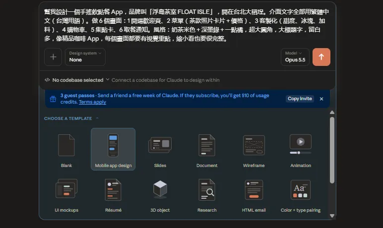
- Under "CHOOSE A TEMPLATE", click "Mobile app design".
- Design system (bottom left): choose None if you have no brand guidelines yet; if you've already built a brand system, pick it here and the app follows your colours and fonts.
- Don't hit send yet. Write the prompt in the next step first.
03Step 2: say three things in the prompt: brand, screens, style
Write "make me an ordering app" and Claude has to guess. We split the prompt into three parts: who the brand is, which screens you need and what it should look like. Number the screens in the order a customer actually uses them.
Design a [type, e.g. bubble-tea ordering] app for a brand called "[brand name]", based in [city and district]. Write all interface text in English.
Make 6 screens: 1 [screen one], 2 [screen two], 3 [screen three], 4 [screen four], 5 [screen five], 6 [screen six].
Style: [main colour + second colour + a touch of accent], extra-large rounded corners, big headings, lots of white space, like a [kind of app you like]. Every screen needs a clear focal point and should still look complete when zoomed out.
For FLOAT ISLE we actually pasted this (in Chinese; translated here):
Design a bubble-tea ordering app for a brand called "浮島茶室 FLOAT ISLE", based in Dadaocheng, Taipei. Write all interface text in Traditional Chinese (Taiwan usage). Make 6 screens: 1 welcome screen, 2 menu (drink photo cards + prices), 3 customisation (sweetness, ice, toppings), 4 cart, 5 stamp card, 6 pickup notice. Style: milk-tea beige + deep ink green + a touch of orange, extra-large rounded corners, big headings, lots of white space, like a boutique coffee app. Every screen needs a clear focal point and should still look complete when zoomed out.
04Step 3: watch it build and check, then read its summary
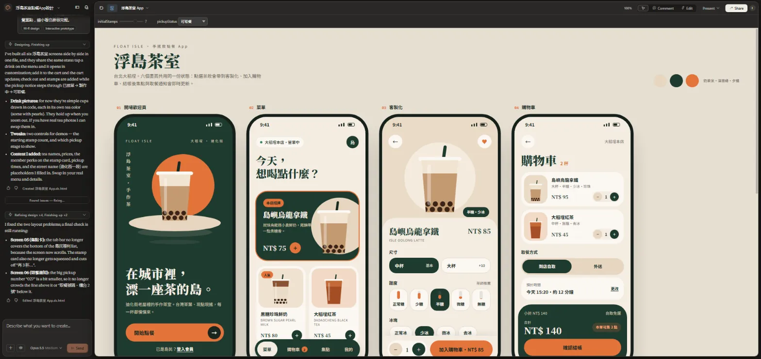
After you send it, the chat sits on the left and the canvas fills in piece by piece on the right. You can see which element it's adding, such as the "Start ordering" (開始點餐) button.
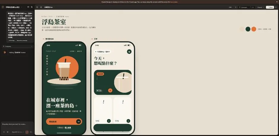
When it's done, all 6 screens sit on one board, topped by the brand name, a one-line description and the three main colours: milk-tea beige, deep ink green and sunset orange.
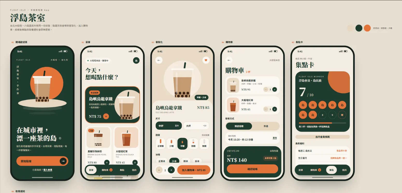
Then it writes a short summary. Read it. This time it told us three things:
- Drink pictures: for now they're simple cups drawn in code, each in its own tea colour (some with pearls), and they hold up when zoomed out. Real product photos can be swapped in.
- Tweaks: two demo controls, one for the stamp card's starting count and one for which pickup stage to show.
- Content it added: the tea names, prices, member perks, pickup times and street name (Dihua Street Sec. 1) are placeholders it filled in. Replace them with your real menu.
Next it hunts for problems and fixes them itself. It caught two layout issues: on the stamp-card screen the tab bar covered the bottom of the member-perks list, so it made the screen scroll; on the pickup notice the big "027" crowded the lines above and below, so it made the number a little smaller.
05Step 4: click around, it's a working prototype
These 6 screens aren't 6 pictures; they share the same data. Tap a drink on the menu and it opens in customisation; add it to the cart and the cart updates; check out and stamps are added while the pickup notice steps from "order received" to "preparing" to "ready for pickup".
Above the canvas is the Tweaks bar it added: initialStamps sets the stamp card's starting count (we left it at 7) and pickupStatus jumps straight to "ready for pickup". To show someone a particular state, you don't have to click through from the start.
06Step 5: swap the placeholders for your real menu
Follow the summary from step 3 and say in one go what to replace and what to leave alone. If you have product photos, add them with the "+" at the bottom left of the chat box and ask it to replace the code-drawn cups.
Replace the placeholder content in the app with real details:
Menu: [item name + price, one per line]
Member perks: [e.g. 10% off everything on Wednesdays]
Address: [your address]
Replace the cup illustrations with the product photos I've attached, one photo per item.
Don't change the layout, colours or buttons.
07Step 6: click Share, then export or send to Claude Code
The Share menu (top right) has two parts. The top controls who can see it: ours said "Only you can see this design", and you can copy a link or publish it as a public artifact. The bottom is Export.
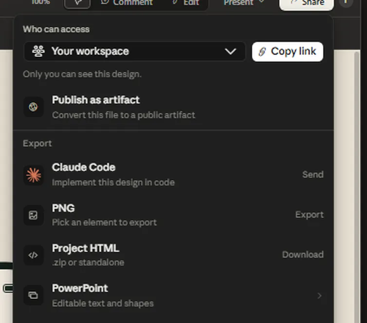
- To show a client or teammate: export a PDF or PowerPoint (PPTX). The official export formats are PDF, PPTX and standalone HTML, plus sending to Canva.
- To put it on the web or keep a copy: choose Project HTML, as a .zip or a single HTML file.
- For a single image: our menu had PNG, which exports one element you pick. The official page doesn't list it, so go by what your menu shows.
- To build a real app: click Send next to Claude Code. Anthropic says it packages a handoff bundle so Claude Code can write code from this design.
08Good to know
- FLOAT ISLE (浮島茶室) is a fictional brand and all 6 screens were generated by Claude Design as a demo. The tea names, prices, member perks, pickup times, the Dihua Street address and the customer "Ms Lin" are placeholders the AI filled in.
- We made this on claude.ai/design on 15 October 2026. Template names and menu positions are what we saw then; the interface may change.
- The standalone claude.ai/design site stays open until 14 December 2026, and Claude Design already works inside normal Claude conversations. Export important projects as a backup.
- Clickable doesn't mean it's a real app: nothing is actually ordered or paid for. To ship it you still need a back end, payments, testing and App Store / Google Play review.
- For commercial use, check the fonts are licensed for it, such as Noto Sans TC (SIL OFL).