Make a Claude deck that looks like an Apple keynote: study a big brand's deck, make the photos, then use Claude Design
Skip the template. Study one big-brand keynote, make black-background product shots in ChatGPT, then have Claude Design build 10 slides with one hero each.
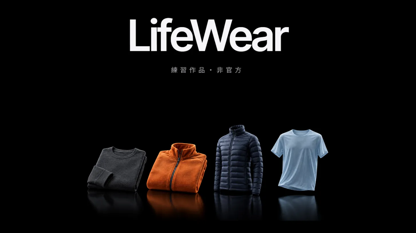
Why do other people's Claude decks look like an Apple keynote while yours looks like a Word export? Claude can lay out slides fine. The problem is that you started by picking a template. In this guide we followed one order, big-brand deck → ChatGPT product photos → Claude Design, and made a 10-slide UNIQLO practice deck. It is a practice piece, not official, and has nothing to do with UNIQLO or Apple. Every image below is our real output and our real revisions.
01Open Claude Design (1 minute)
- Go to claude.ai/design and sign in with your Claude account, or open Claude Design straight from a normal Claude chat.
- Claude's official article of 8 October 2026 says Docs, Slides and Design are out of beta and on every plan, including Free.
- Start a new project and pick the template for presentations. We picked “Slides”. Official pages don't list template names, so the interface may change.
- Don't type yet. Get your references and photos ready first, in the order below.
- Claude Design official page — Plans; the standalone site stays open until 14 December 2026
02Step 1: study one big brand's deck and turn it into rules
Most people open their slide app and pick a template first. A template only gives you something that looks like a deck. Look at real decks from big brands instead, pick one, and write down why it works.
We studied the spec slides from Apple's M1 keynote, plus brand decks from Nike and AMAN. Then we wrote 5 rules, and all of them went into the prompt:
- One idea per slide: a slide is either one giant number or one product photo, never both crowded together.
- White type on black, with one accent colour used only on the hero words.
- Product photos are cut out on black and lit like a launch. No stock scenes, no icons.
- Numbers are huge (200px and up); captions are small and letter-spaced.
- The climax is a spec grid: rounded dark tiles in mixed sizes, each with one number and one short caption, the product in the middle.
03Step 2: make the product photos in ChatGPT, on the same background as the deck
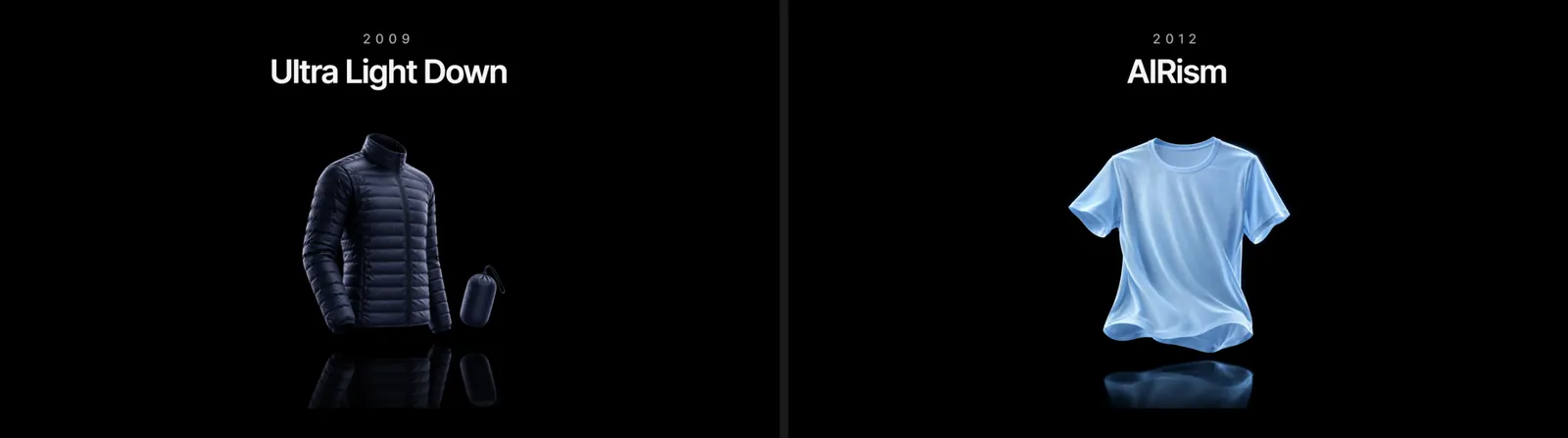
Without photos, Claude Design leaves grey placeholder boxes and the deck instantly looks unfinished. Make each slide's hero photo in ChatGPT first. We made a fleece jacket, a light down jacket, an AIRism tee and a thermal top, plus a fabric close-up and a four-product line-up for the closer.
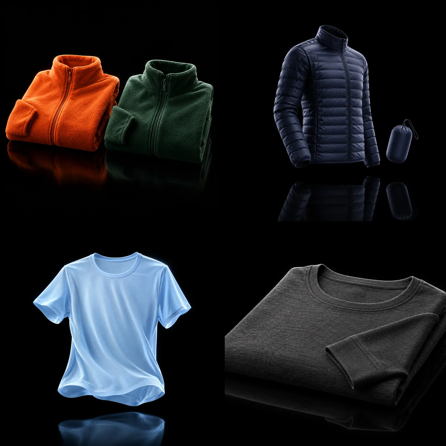
[Product, e.g. two folded fleece jackets, one orange, one dark green], product-launch lighting, pure black background, soft reflection on the floor. [Material detail, e.g. thin, stretchy fabric]. No text, no logo, no people. [16:9 or 1:1].
04Step 3: attach the photos, paste the prompt, one hero per slide
Back in Claude Design, attach all the product photos first, then paste this prompt. Every rule from Step 1 goes into it.
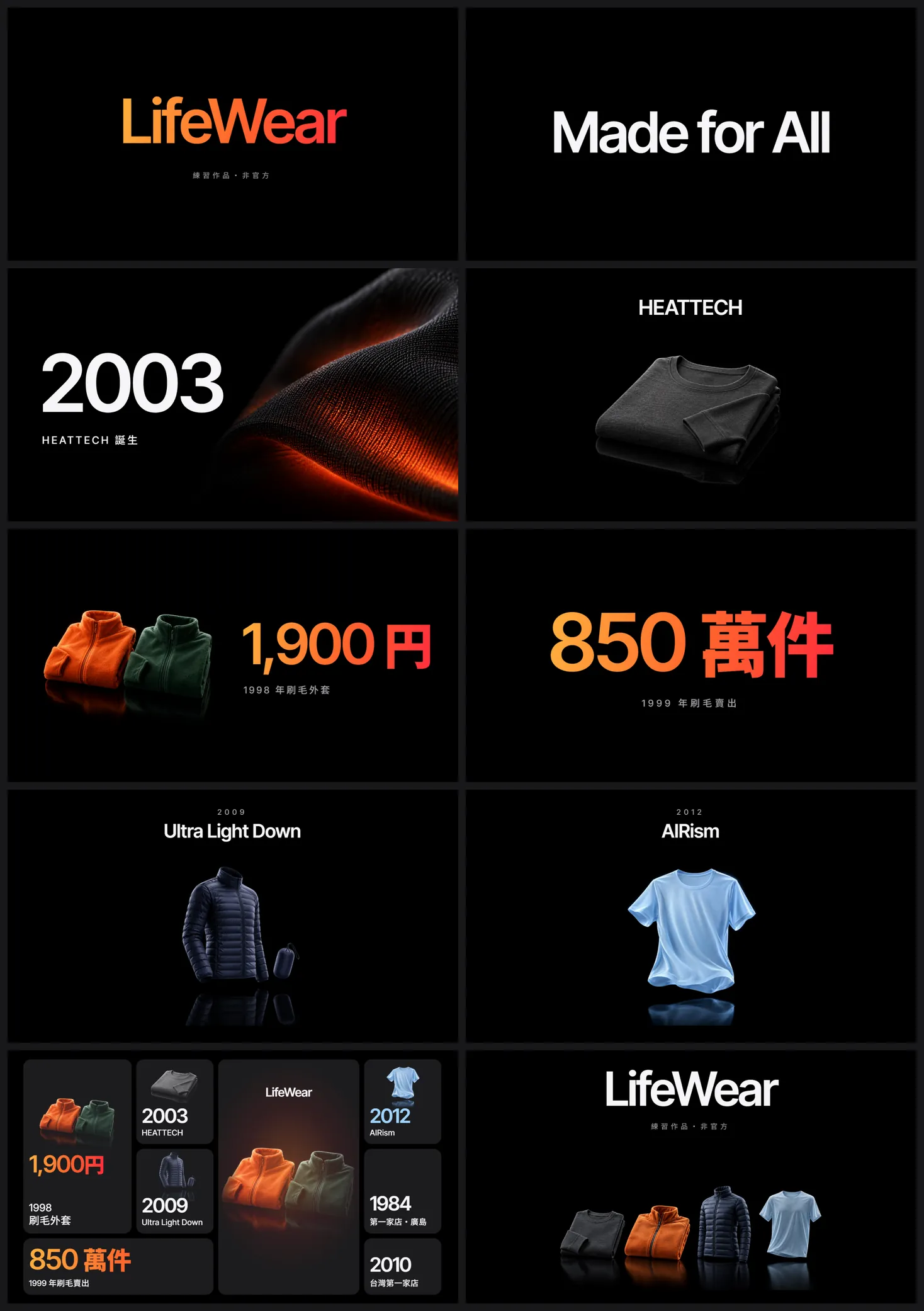
Make a 10-slide 16:9 brand deck “[brand name] · practice piece”. Style reference: [a big-brand keynote, e.g. Apple's M1 keynote]: white type on pure black; each slide has only one hero element (one giant number, one year or one product photo) and everything else is small; only two type sizes: huge (120–200px) and small captions; one [accent colour] gradient, used only on the hero words; use only the product photos I attached; the numbers are the story, so set years, unit counts and prices as large as possible; leave empty space empty, no decorative shapes; make slide 9 a spec grid of mixed-size tiles, each with one number and one short caption, the product in the middle. Slides: [list what goes on each of the 10 slides, using only facts you have checked]. All text in Traditional Chinese. Don't leave any grey placeholder boxes.
What we actually pasted (in Chinese) said: make a 10-slide UNIQLO keynote deck (practice piece) in the style of Apple's M1 keynote; white on pure black; one hero per slide, either one giant number or one product photo; one warm orange gradient on the hero words only; slide 9 as an Apple-style spec grid of mixed-size tiles; use my black-background photos and only the facts I give you. Then we listed what each of the 10 slides should hold.
05Step 4: the numbers are the story, so make them huge
A keynote doesn't show a paragraph of background. It drops one number. We gave the 1998 fleece price, 1,900 yen, its own slide, and the next slide drops 8.5 million units. One number per slide hits much harder than three bullet points on one.


06Step 5: make the climax a spec grid
The most recognisable slide in an Apple keynote is the spec grid with tiles of different sizes. We used it on slide 9 as a recap of the whole deck: each tile holds one year or number plus a small product photo, and the biggest tile in the middle holds the fleece jackets.
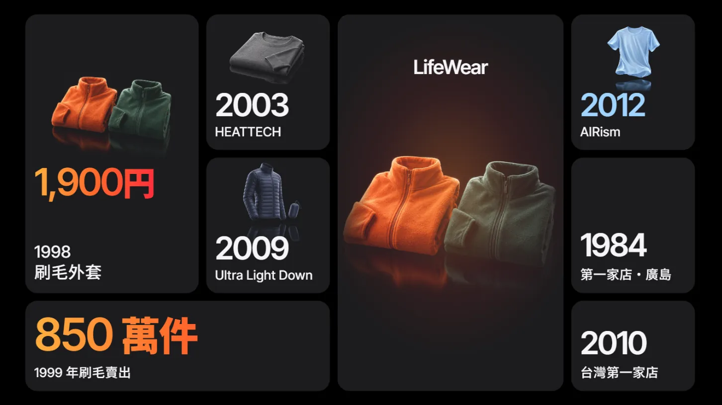
- Mix the tile sizes: one double-width, one tall, the rest small.
- One number and one short caption per tile, with the number big enough to read at phone size.
- Give the gradient to only the one or two most important tiles; the rest stay white.
- Put the product in the middle tile and let its reflection fade out inside the tile.
07Step 6: check against the reference, fix one thing at a time
The first version is usually only 60–70% there. We put each version next to Apple's spec slide and did 3 rounds of fixes: mixed tile sizes in the grid, a new fabric photo, the gradient kept only on the hero numbers, Chinese type weight matched to the numbers, and a new closing slide.
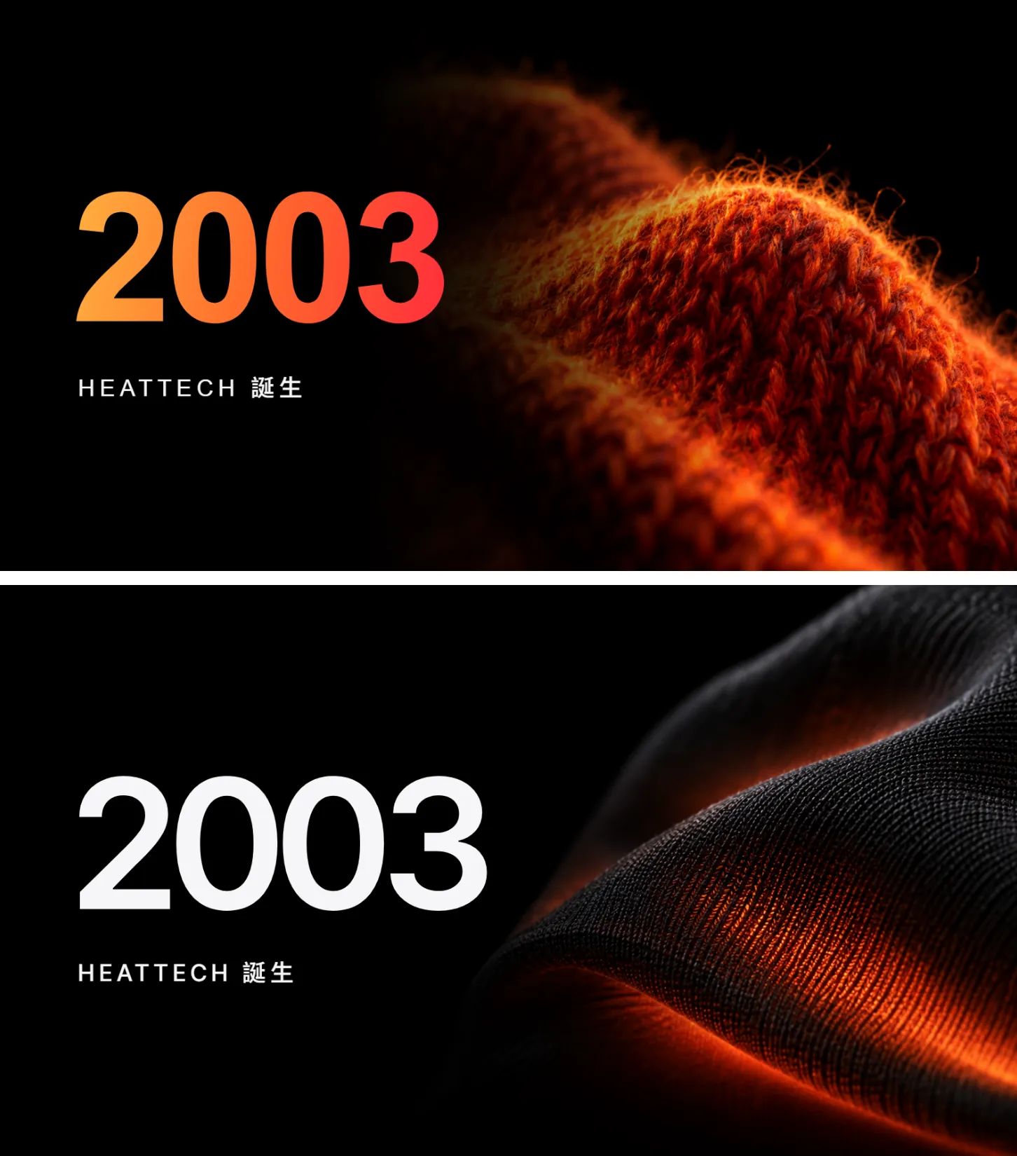
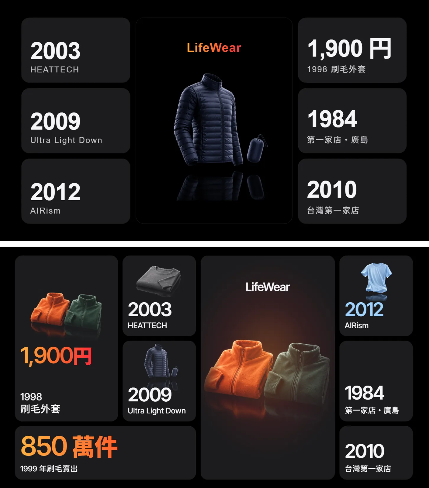
Rebuild slide [9] as a spec grid like the one in [reference deck]: 7–8 tiles in mixed sizes (one double-width, one tall). Put the gradient only on [the two most important numbers]. Add a small cut-out product photo to [which tiles]. Put [product] in the middle tile with its reflection fading out inside the tile, no border. Don't change any other slide.
When it's right, save it with the export feature. The official export formats are PDF, PPTX and standalone HTML, and you can also send it to Canva.
08Good to know
- This UNIQLO deck is a practice piece, not official, and has no connection to UNIQLO, Fast Retailing or Apple. We borrowed only the layout rules of Apple's keynotes and used no Apple logo or images.
- Every product photo in the deck is an illustrative image made by ChatGPT, not a real UNIQLO product photo. The layout was generated by Claude Design.
- LifeWear, HEATTECH, AIRism and Ultra Light Down are UNIQLO brand and product names. If you put a practice piece in your portfolio, label it as practice, don't use it commercially, and don't let anyone think it's official.
- The 1949 founding, the first store in Hiroshima in 1984, the 1991 rename to Fast Retailing, the 1,900-yen fleece in 1998 and the first Taipei store in 2010 are all on Fast Retailing's official history pages. The 8.5 million figure and the three product years are public information we gathered for Claude; the official history pages don't list them year by year, so check them before real use.
- “Slides” is the template name we picked. Official pages don't list templates, so the name may change.
- The standalone claude.ai/design site stays open until 14 December 2026, and Claude Design already works inside normal Claude chats. Export important projects first.
Sources
- Claude: Docs, Slides and Design out of beta, available on the Free plan (8 Oct 2026)
- Claude Design official product page (plans, claude.ai/design dates)
- Anthropic: Introducing Claude Design (export formats)
- Fast Retailing official history 1949–2003
- Fast Retailing official history 2010 (first Taiwan store)